
We Love Our Quilting Community
At High Country Quilts we care deeply about community. With our experiences in retail, we know that a store is not only a place to shop but also a place for the community to gather and share. During this busy...


You're probably looking at a fabric bundle online right now, wondering why some “white” fabrics look calm and beautiful in a quilt photo, while others turn fussy the second you zoom in. That confusion is normal. Low volume quilting fabrics sound simple, but they're one of those quilting ideas that get clearer only when you understand what they're doing inside a quilt.
A lot of beginners think low volume means plain white fabric. It doesn't. Others buy a print that seems soft on a website, then cut it up and realize it's much louder than expected. That happens all the time, especially when you're planning quilts on a phone or laptop.
At High Country Quilts, we talk with quilters who want that airy, modern look without ending up with a background that fights the rest of the quilt. The good news is that low-volume fabric choice can be learned. Once you know what to look for, your fabric pulls get easier, your blocks read more clearly, and your quilts gain that quiet texture that makes modern patchwork so satisfying.
You see this most clearly when you shop online. Two fabrics can both look “white” on your screen, but one will behave like a calm background in a quilt and the other will start pulling your eye the moment it is cut into blocks. That gap between screen appearance and real-life contrast is a big reason low-volume fabrics confuse newer quilters.
Low volume quilting fabrics are fabrics that read light overall, even though they have a print. They usually start with a pale base such as white, cream, soft gray, or another quiet neutral, then add subtle motifs like text, dots, grids, tiny florals, or tone-on-tone shapes. Quilters use them when they want the background to have texture without taking over the design. Cluck Cluck Sew describes low-volume fabrics in much the same way in this low-volume fabric guide from Cluck Cluck Sew.

A solid gives you a clean, even field of color. A bold print brings strong personality and asks for attention. Low volume does a different job. It works like wallpaper behind the furniture. You notice the room feels finished, but the background is not what shouts first.
That is why low-volume fabrics are so useful in quilts. They let piecing lines, bright colors, and shape contrast stay easy to read, while still keeping the background from feeling flat.
Practical rule: If the fabric still looks mostly pale and quiet from a few steps back, it may be a low-volume print.
Low-volume prints add softness and depth. They can make a quilt feel airy, layered, and a little more forgiving than a plain solid background.
They are especially helpful in modern quilts, where open space often matters as much as the featured prints.
Beginners usually notice a few benefits right away:
This part matters. Low volume is about value first, not just color name.
A fabric can include black text, light geometrics, scattered florals, or tiny symbols and still read as low volume if the overall effect stays soft. A white background alone does not guarantee that result. If the print is dark, crowded, or oversized, it may act more like a feature fabric than a background.
Online shopping makes this trickier because screens often flatten contrast. A print that looks faint in a product photo may feel much stronger in person, especially under sewing-room lighting. If you are unsure, look past the color description and ask a better question: from across the room, does this fabric still read light?
Here is a simple comparison:
| Fabric type | Up close | From a distance | Usual role |
|---|---|---|---|
| Solid white or cream | Plain | Plain | Crisp background |
| Low volume print | Patterned | Soft, light, subtle | Textured background |
| Busy multicolor print | Detailed | Active, attention-grabbing | Focal or accent fabric |
A good low-volume fabric supports the quilt the way batting supports the quilt. It matters, even when it is not the first thing you notice.
If a quilt feels calm, clear, and well balanced, the background choices usually played a big part. Low-volume fabrics give you negative space with a little life in it. That combination is what makes them so useful, and why understanding how they read in real life is more important than how soft they look on a phone screen.
You find a fabric online that looks like the perfect quiet background. Then it arrives, you open the package, and suddenly those faint little marks look much darker than they did on your phone. That is one of the most common frustrations with low-volume shopping, especially for newer quilters.
Choosing low volume quilting fabrics gets much easier once you judge them by how they will behave in a finished quilt, not by how soft they look in a single product photo. What matters most is whether the fabric stays calm after cutting, sewing, and standing back a few feet.

Low-volume fabric works like a supporting actor in a good cast. It adds texture and interest, but it should not pull your eye away from the stars of the quilt.
That is why I encourage quilters to ask a practical question first: Will this fabric act like a background, or will it start acting like a print?
A good low volume usually has three traits working together:
SewCanShe shares a similar idea in her advice on choosing fabrics for a low-volume quilt. Mixing low-volume prints can create a lovely textured background, as long as the group still reads light and quiet.
Quilters often make low-volume decisions too close up. At six inches away, you see the print. At arm's length, you see the fabric's role.
Try one of these quick tests:
If a print starts looking peppered, gray, or spotty from a distance, it may be too strong for a true background. If it settles into one soft value, that is a much better sign.
Many low-volume choices go wrong at this point.
A print can behave beautifully in yardage and still become awkward in patchwork. Large scattered motifs may seem delicate on the bolt, but once they are sliced into 2-inch squares or half-square triangles, each piece may contain one lonely dark shape. Instead of a quiet background, you get repeated little interruptions.
Small patchwork magnifies print behavior.
Before you buy, pause and picture the fabric in the size pieces your pattern uses most. If you are making tiny blocks, tiny and sparse prints usually behave better than medium prints with stronger contrast. If you are making large background areas, you have a bit more room to use airy text prints, grids, or gentle florals.
A low-volume quilt becomes more interesting when the fabrics are related, but not identical. Using all tiny dots can make the background feel flat. Using too many medium prints can make it restless.
The sweet spot is a quiet mix.
Try combining fabrics like these:
The group should feel like different fabrics from the same conversation. No single print needs to speak the loudest.
Online shopping is convenient, but screens are not honest about contrast. Bright screens can wash a fabric out. Dim screens can make cream look gray. Product photos also vary. One shop may photograph fabric in very bright light, while another uses warmer lighting that softens everything.
That means low-volume shopping online is partly a translation exercise. You are trying to convert a screen image into a real fabric in real room light.
Here are the clues I rely on most:
If a shop provides several photos, use them. A flat product shot, a styled quilt photo, and a close-up together usually tell you more than any one image alone.
If you are unsure about a fabric, run through this short checklist:
| Question to ask | What you want to see |
|---|---|
| Does it read light from a few feet away? | The fabric blends into a soft overall value |
| Are the darkest details small and spread out? | No heavy clusters or repeated dark patches |
| Will the print still behave well in small pieces? | Motifs stay subtle even in cut units |
| Does it coordinate with your other low volumes? | It adds variety without becoming the loudest fabric |
| Does the screen photo show a calm print on more than one image? | The fabric looks consistently soft, not just flattering in one shot |
If you can answer those questions comfortably, you are usually choosing well.
Good low-volume fabrics do quiet work. They soften sharp contrast, give your eye a place to rest, and make stronger prints look even better. Once you learn to judge them by distance, scale, and screen-to-real-life contrast, buying them gets much less mysterious.
Your fabric arrives in the mail, and the bundle looks different from what you expected on screen. One print that seemed almost solid now reads speckled. Another looks softer than the photo showed. That is normal, and it is one reason prep matters so much with low-volume fabrics.

Low-volume backgrounds ask for accuracy because they show small problems quickly. A slightly wavy strip, a stretched edge, or uneven bulk in a seam can stand out on pale fabric the way a pencil mark stands out on white paper. Careful prep gives you cleaner cuts and calmer-looking blocks.
Quilters answer this differently, and the best choice depends on the project in front of you.
If you want the crispest cutting experience, you may leave quilting cotton unwashed and use it straight from the shop. If you are combining fabrics from different manufacturers, worry about color transfer from darker companions, or prefer washed fabric, wash everything before you cut.
The key is consistency. If half your low volumes are washed and half are not, they can shrink, soften, and press differently. That difference may be small in the stack, but it becomes noticeable when you are matching points.
A simple way to decide is to ask:
If you are new to low-volume piecing, starch or sizing is one of the easiest ways to improve accuracy.
These fabrics often look similar, but they do not always behave the same. One may feel firm, another drapey, another slightly loose in the weave. A light pressing with starch helps them act more alike, which makes your ruler work more dependable.
Workshop note: Stable fabric is easier to measure, easier to cut, and less likely to stretch at the edges.
You do not need stiff, crackly fabric. You want fabric with a little body, enough that strips stay straight and small pieces hold their shape while you trim and piece them.
Subtle prints can make cutting lines harder to read. Pale dots, tiny text, or scattered gray motifs sometimes hide right under your ruler markings. If you have ever cut a cream print and then realized the edge drifted a thread or two, you have already seen this.
A few habits help:
Online shopping adds one more layer. A fabric that looked quiet on your laptop may arrive with more contrast than expected, especially if the print has tiny dark details. Before you cut the full piece, open it up under good light and step back a few feet. That quick check tells you more than a folded bundle or a product photo can.
This is the step many beginners skip, and it saves a surprising amount of frustration.
Cut one square or one short strip from each low-volume option and place those test pieces beside your feature fabrics. Fabric changes character when it is cut smaller. A print that looked soft in yardage can turn busy in a 2 1/2 inch square, much like a wallpaper pattern can feel different once you see it on a tiny sample card.
You are checking three things:
| What to test | What you're looking for |
|---|---|
| Value | Does the fabric still read light after being cut smaller? |
| Noise level | Does the print become choppy or distracting? |
| Compatibility | Does it support the stronger fabrics instead of pulling attention? |
If one fabric suddenly reads gray, spotty, or harsh next to the others, set it aside for another project. That is not a bad purchase. It just means the fabric has a different job.
A visual walkthrough can help if you're still building your cutting routine:
Low-volume quilts get their quiet look from many small, careful choices made before the first seam. Straight cuts, consistent prep, and a quick real-life contrast check turn soft background fabrics from uncertain to reliable.
Low-volume quilts ask your stitching to be a little more disciplined. Pale fabrics behave like light paint on a wall. They show every ripple underneath. If your seam allowance drifts, your thread is too dark, or a bulky intersection stacks up in one spot, you are more likely to see it on the front.
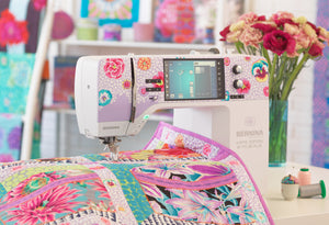
A BERNINA can help with that, but the primary advantage comes from setup and habits, not speed. Beginners often assume a good machine will automatically fix uneven piecing. In practice, the machine gives you repeatability. You still need to tell it what kind of precision the quilt requires.

A reliable quarter-inch seam matters more in low-volume quilts because the design often depends on clean edges and calm negative space. If your BERNINA has a patchwork foot you like, use it. Many quilters prefer that foot because it gives a clear visual reference, which is especially helpful when similar pale prints can make edges harder to read.
Slow the machine down a little if you tend to outrun your hands. That small change often improves straight seams more than any other adjustment.
Needle and thread choices matter too. A fine, sharp needle usually gives cleaner piecing on quilting cotton, and a thinner piecing thread helps reduce bulk. Choose a thread that blends quietly across your light fabrics. White is not always the best answer. Sometimes a soft beige, gray, or ivory disappears better, especially if you bought your low-volume fabrics online and the fabric arrived warmer, cooler, or darker than it looked on your screen.
This is often the surprise for newer quilters. A pale print can look forgiving in a product photo, then show every shadow once it is sewn into a block.
The same principle applies after you buy online. On a screen, two backgrounds may both look "white enough." Under the needle, one may read creamy and dense while the other reads bright and airy. That difference affects thread visibility, seam shadowing, and how bulky intersections show through. If you notice that one low-volume fabric has more pigment or tighter print coverage than expected, adjust your thread and pressing choices to suit the actual fabric in front of you, not the one you thought you ordered.
A few habits help keep the front of the quilt looking clear:
Pressing changes appearance as much as accuracy. In low-volume patchwork, a well-pressed seam helps the fabric stay bright instead of slightly grayed by buildup underneath.
Low-volume piecing usually benefits from a steadier rhythm. Similar soft prints can make it harder to spot a crooked edge quickly, so give yourself more visual checks along the way.
If your online order included fabrics that ended up closer in value than expected, clean piecing becomes even more important. The block lines may be doing most of the work of separating one fabric from another. In that situation, sharp seams are what keep the pattern readable. Print differences alone may not be enough.
If you're sewing low-volume patchwork on your BERNINA, this is a practical routine to try:
For quilters comparing tools, feet, and machine support, High Country Quilts BERNINA pages are one place to review machine-related options and local dealer resources.
| Problem | Likely cause | Try this |
|---|---|---|
| Background looks wavy | Fabric stretched while sewing | Lower speed, reduce handling, and press instead of pushing the iron |
| Seams show through | Dark seam allowance, dark thread, or heavy buildup | Trim bulk, choose a softer thread color, and press carefully |
| Blocks finish small | Seam allowance too wide | Re-test on scraps and adjust before sewing more units |
| Similar low volumes blur together | Fabrics looked lighter or more distinct online than they do in person | Keep seams crisp and sort fabrics by real-life contrast before continuing |
A well-set BERNINA and a few steady habits give you cleaner seams, flatter blocks, and low-volume backgrounds that stay light, readable, and intentional.
Some fabrics tell you what they want to be. Low-volume fabrics usually want room to breathe.
That's why they shine in patterns where the background matters just as much as the focal fabrics. If a pattern has clear negative space, repeated light units, or a modern graphic layout, low-volume prints can make it feel softer and more layered without losing definition.
A modern Irish Chain is a good example. The repeated light areas can carry many different subtle prints while the chain itself stays readable. You get movement in the background without losing the shape of the design.
Log Cabin quilts also work beautifully with low-volume lights. If the dark or colorful logs do the visual lifting, the low-volume side can bring texture and freshness to a very familiar block.
Other strong options include:
The best low-volume projects give the eye two experiences at once. Up close, you notice the texture. From farther back, you see a clean, readable design.
When you're looking through patterns, ask yourself a few practical questions.
Does the pattern depend on the background staying visually quiet? If yes, low volume may be a strong fit.
Will the pieces be very small? If yes, be pickier about print size and density.
Does the pattern include large background areas? That's often where low-volume fabrics really come alive, because you can appreciate the subtle changes across the quilt top.
If you're new to low-volume quilting, I'd begin with something forgiving.
A simple patchwork quilt using one colorful fabric family plus mixed low-volume backgrounds is a gentle first project. You'll immediately see how much interest the “quiet” fabrics add.
A star quilt with low-volume background units is another nice option. It teaches you how background choice affects shape visibility.
You can also use low volume in small projects first. Try a pillow cover, table runner, or baby quilt before cutting for a full bed-size top. Small projects teach your eye quickly.
What surprises many beginners is that low volume doesn't have to mean soft and sweet. It can also feel crisp, modern, playful, or graphic depending on the prints you choose. Tiny text, loose dots, pale geometrics, and subtle novelty prints all create slightly different moods.
Low-volume quilting fabrics make more sense once you stop thinking of them as plain light prints and start seeing them as a design tool. They soften backgrounds, create texture, support stronger fabrics, and help modern quilts feel open instead of crowded.
They also ask you to slow down in useful ways. You look at value more carefully. You notice print scale. You test fabric not just on the bolt, but after cutting. If you shop online, you learn to judge how a subtle print might shift from screen to real life.
That kind of attention pays off. Your blocks read more clearly. Your backgrounds feel intentional. Your finished quilt has that layered, calm look that draws people in.
High Country Quilts is built for that learning process. If you want to compare pale prints in person, explore quilting fabrics for a new project, look at BERNINA machines and accessories, or ask questions before you cut into your fabric, the shop gives you a place to do that with real support. Local classes and community connections can also help if you learn best by seeing techniques demonstrated and trying them with guidance.
If you're in the early stages, start small. Pick a pattern with clear contrast. Gather a handful of low-volume options instead of one. Cut test pieces. Sew one block. Let your eye adjust.
That's how confidence grows in quilting. Not all at once. One good fabric choice at a time.
If you're ready to start, browse High Country Quilts for quilting fabric, BERNINA resources, and project supplies, or visit the shop in Colorado Springs to see low-volume fabrics in person and get help choosing prints that will work beautifully in your next quilt.
At High Country Quilts we care deeply about community. With our experiences in retail, we know that a store is not only a place to shop but also a place for the community to gather and share. During this busy...

Hi! We’re Adam and Renee Wheaton, the new owners of High Country Quilts! For more than 40 years, we’ve owned and operated vacuum and sewing businesses. Following in Renee’s father’s footsteps after he retired from All Discount Vacuum and Sewing in Colorado...


Leave a comment