


Free Fabric All Year: Our 2027 Fabric Punch Card
November 2–25 only: buy a $200 gift card in either store and get a free yard of fabric every month of 2027.

Last Updated: November 15, 2026
Quick Summary
To match fabric colors online, start with a clear reference color photographed in daylight, then use a color picker tool to get its HEX code. Adjust your screen to a neutral brightness and color temperature, and confirm the final match with physical swatches viewed in natural light.
Matching fabric colors online is harder than it looks. Your screen shows color using light, and fabric shows color using dye and reflected light. Those two systems rarely agree, so a fat quarter that looks perfect on your laptop can arrive looking a shade off.
Screens vary widely. Brightness, contrast, and color temperature all shift how a fabric appears. Two monitors side by side can show the same print in noticeably different tones. Phone cameras add another layer, since they adjust white balance automatically.
Lighting matters too. A blue fabric looks greener under warm bulbs and more gray under cool office light. That is why the same bolt can look different in your sewing room and in our store.
Three settings often account for much of the mismatch between what you see online and what arrives in the mail:
A quick calibration check you can run without special hardware: open a pure white image and a pure black image on your screen, then compare them to a sheet of white printer paper and a black fabric scrap in the same room. If the white image looks blue or yellow next to the paper, your display is tinted.
Watch out: Do not judge fabric color on a phone with auto-brightness turned on. The sensor changes screen brightness as room light changes, so the same listing can look different from one minute to the next.
Keep these points in mind as you work:
Before you search, decide what you are matching. A reference color can be a thread, a finished quilt block, a painted wall, or a photo of a design you love. The clearer your reference, the easier the match.
Try this simple process:
Watch out: Do not rely on a single photo taken under yellow indoor lights. Shoot your reference again in daylight before you start shopping.
A color picker tool reads the exact color from your reference image and gives you a HEX code, a six-character code like #4A7C8E. You can then compare that code against fabric listings. Many free picker tools work right in your browser or on your phone.
Follow these steps:
A HEX code tells you the color in digital terms, but it does not guarantee the printed fabric will match. Treat it as a starting point, not a final answer.
If you have access to more than one screen, compare the same color on each. Look for the shade that appears most consistent. This shows you how much your display shifts the color.
Here is a quick check you can run:
Once you have a match, you may need fabrics that work together. Quilting fabric color coordination is about balance. Pick one dominant color, one supporting color, and one accent. This keeps a quilt from looking chaotic.
A few coordination tips help:
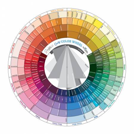
Color theory gives you a reliable way to build palettes. Use these principles as a checklist:
Most successful palettes use one of these as a base and add one unexpected accent.
Digital matching gets you close, but physical swatches get you certain. Order swatches of your top candidates, hold them against your reference in natural light, and make the final decision in person.
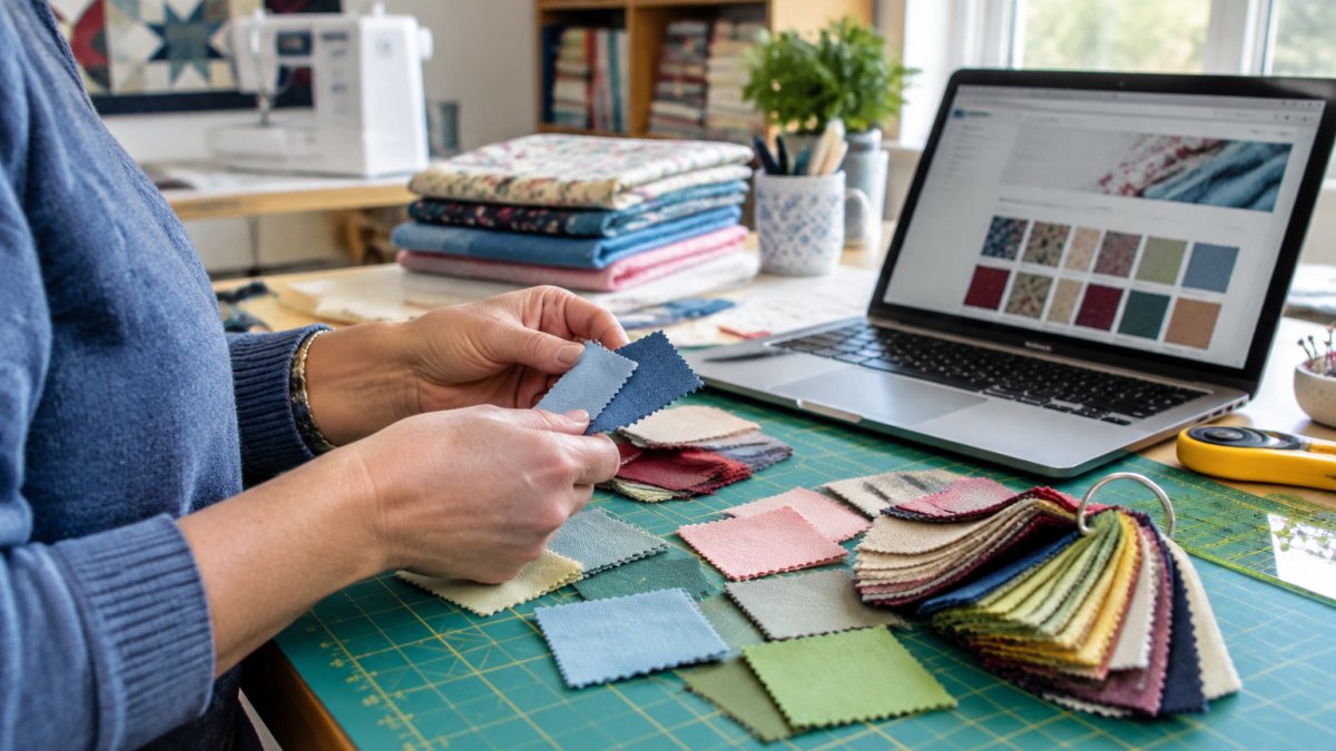
A swatch-first process works best when you treat it as a decision, not a formality. Use this sequence:
Fabric type changes the comparison. A cotton solid, a linen blend, and a flannel will read differently even when the dye formula is close, because texture and finish change how light reflects. A shiny fabric looks lighter than a matte fabric of the same color. If your project mixes substrates, evaluate the swatches as a group, not one at a time.
Set a tolerance before you shop. A common pattern is to accept a swatch when hue and value are close enough that you cannot pick out the difference at arm's length in daylight, and to reject it when the value is off by more than one clear step from light to dark. If you are matching a specific print, hold the swatch against the print and check whether the solid disappears into the background or stands apart.
Some practical tips:
Physical swatches are the most reliable way to confirm a match, and the article's key checks are summarised below.
| Check | What to look at | Why it matters |
|---|---|---|
| Hue | Color family, such as blue versus green | Confirms the basic color matches |
| Value | How light or dark the swatch is | Most common reason a quilt looks muddy |
| Saturation | How gray or vivid the color looks | Separates close shades |
| Daylight | Judge near a north-facing window | Avoids sun and shop-light color casts |
| Distance | View at arm's length and across the room | Matches how a finished quilt is seen |
| Batch | Order 3-5 candidates in one order | Lets you compare them side by side |
If you plan a large quilt, buy all the yardage at one time. If you must reorder, compare the new cut against your original before you cut into it.
Keep a leftover scrap from every fabric you buy. A small piece lets you check future orders quickly. This habit saves frustration on projects that take months to finish.
You now have a repeatable process: pick a clear reference, use a color picker for a HEX code, coordinate with color theory, and confirm with physical swatches. At High Country Quilts, we carry many options, including the Shimmer Tonals Cotton Fabric - Fat Quarter Set for bright, pearlescent accents, which makes a good test piece for a new palette.
Ready to see the colors in person? Stop by High Country Quilts in Highlands Ranch and compare swatches under natural light before you commit to your next project.
Start with a clear photo of the fabric you need to match, taken in natural daylight with no color cast. Upload or describe it to a fabric color search or use a color picker tool to pull a HEX code from the image. Then filter a shop's catalog by color family and compare candidates side by side. Because screens render color differently, treat the result as a shortlist, not a final answer, and order physical swatches of your top two or three choices before buying yardage.
Calibrate your expectations first: no monitor shows color exactly as cotton looks in hand. Check product photos on two devices, look for listings that show the fabric in multiple lighting conditions, and compare the HEX code or color name against your reference. For a project where the color must be exact, such as a border matching a printed fabric from an existing quilt, order swatches and hold them against the reference under the light where you will sew.
Yes. Color picker tools read a HEX code from any image, and color generators suggest harmonious palettes from one base color. A basic color picker in a free image editor or browser extension works well for pulling a value from a photo. These tools are most useful for narrowing choices. They do not account for how a fabric's weave, sheen or dye lot changes its appearance, so confirm the final choice with a physical swatch.
A photo works well as a starting point if you shoot it in even, natural daylight, avoid shadows and fill the frame with the fabric. Use a color picker to extract the dominant color, then search by that color family in a quilting fabric collection. Photos of printed fabrics are harder to match, so focus on the background or the color you want to match, and order swatches of the closest candidates before buying yardage.
November 2–25 only: buy a $200 gift card in either store and get a free yard of fabric every month of 2027.

Serger and BERNINA Mastery classes, longarm training, bag-of-the-month, Kids Sewing Club and a Highlands Ranch retreat. Here's what's on the calendar in November.

Free gifts, included packages and special pricing on the BERNINA 790 ULTRA, 990, Liberty Editions, L 890 serger and Q Series longarms, now through December 31.


Leave a comment