

We Love Our Quilting Community
At High Country Quilts we care deeply about community. With our experiences in retail, we know that a store is not only a place to shop but also a place for the community to gather and share. During this busy...


Last Updated: October 14, 2026
Color theory is the foundation of successful quilting. It's about understanding how colors interact, blend, and create visual harmony in your finished quilt. When you grasp the basics, matching fabric colors becomes intuitive rather than guesswork.
The color wheel is your best friend. It shows primary colors (red, yellow, blue), secondary colors (orange, green, purple), and how they relate to each other. Complementary colors sit opposite each other on the wheel. Analogous colors sit next to each other. Understanding these relationships helps you make intentional choices instead of randomly grabbing fabrics.
Value is equally important. Value refers to how light or dark a color is. A dark navy blue and a light sky blue are the same hue but different values. Many quilters focus on color and forget about value, which is a common mistake. Your quilt's contrast and visual impact depend heavily on value choices.
At High Country Quilts, we help quilters understand that color theory isn't complicated. You don't need to memorize the color wheel. You just need to know enough to make confident decisions about which fabrics work together.
Learning how to match fabric colors for quilting starts with a simple process. You gather samples, test combinations, and refine your choices before cutting. This method removes the guesswork and builds confidence.
Start by collecting all the fabrics you're considering for your quilt. Pull them from your stash or visit a local fabric store to see options in person. Seeing fabric colors in natural light matters. Online photos don't always match reality, which is why many quilters prefer shopping where they can touch and compare in daylight.
Lay your samples on a white or neutral background. White shows true colors without interference. Avoid dark surfaces, which can distort how colors appear. Organize your samples by category: background fabrics, accent colors, and prints.
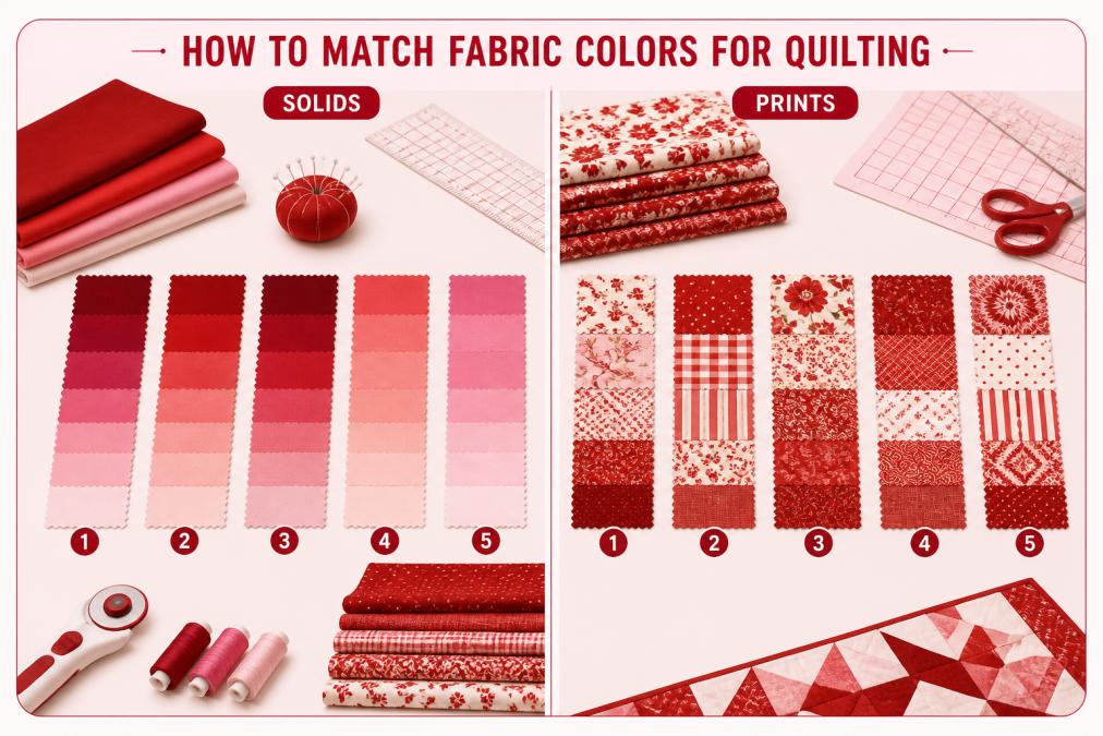
Look at your fabric samples and ask: which are light, which are medium, and which are dark? Squint at them. Squinting removes color and shows you pure value. If all your fabrics are similar value, your quilt will look flat. You need contrast.
A strong quilt typically has:
Take a photo of your samples with your phone. Viewing the photo in black and white removes color entirely and shows value clearly. This trick catches problems you might miss looking at the actual fabrics.
Arrange small pieces of your chosen fabrics together. Don't rely on mental pictures. Physical arrangement shows how colors and prints actually interact. Place them in the pattern layout you're planning. Step back. Look from different distances.
Good combinations feel balanced. No single fabric should scream for attention unless that's your goal. If one print overwhelms the others, it's the wrong choice for that role in the quilt.
Mixing prints is where many quilters hesitate. The fear is that prints won't coordinate. The truth is simpler: prints work together when they share a color or value.
Start with a focal print. This is your statement fabric, usually a larger-scale print with multiple colors. Choose your other prints based on what's already in that focal fabric. Pull a solid or small-scale print in one of the focal print's colors. Add another print in a different color from the focal fabric.
Scale matters. Pair large-scale prints with small-scale prints. Two large prints together often compete. Two tiny prints can disappear. Mixing scales creates visual interest and balance.
Solids are your secret weapon. A solid fabric between two prints gives the eye a rest. It also unifies the design. Many quilters use solids as sashing or borders for exactly this reason. Consider pairing prints with solids for a cleaner, more organized look.
Your background fabric sets the tone for the entire quilt. It's often the largest area of fabric, so its color and value matter tremendously.
Light backgrounds make prints pop. They create airiness and showcase intricate fabric designs. Dark backgrounds create drama and make light fabrics stand out. Medium backgrounds offer balance and work with almost any print.
Think about your quilt's purpose. A baby quilt often uses light, soft backgrounds. A wall quilt might use a bold, dark background for impact. A scrappy quilt benefits from a neutral background that lets the variety shine.
The background fabric should either match the dominant value in your other fabrics or contrast with it intentionally. Don't choose a background that falls in the middle ground with your accent fabrics. That creates confusion rather than harmony.
High Country Quilts carries several excellent background options. The Gray Bella Solids from Moda works beautifully as a neutral foundation, and the Zen Grey Bella Solids offers a softer alternative. For those seeking richer tones, the AG Teak Pure Solids provides a warm, sophisticated base that complements both traditional and modern designs.


Creating a cohesive color palette starts with choosing a theme or inspiration. Pull colors from nature, art, or your favorite textiles. Limit yourself to three to five main colors. Too many colors creates chaos. Too few can feel boring.
Monochromatic palettes use variations of a single color. Think light blue, medium blue, dark blue, and navy. This approach is sophisticated and calming. It works beautifully for traditional quilt designs.
Complementary palettes pair opposite colors on the color wheel. Orange and blue. Red and green. Purple and yellow. These combinations are bold and energetic. They work well for modern quilts and contemporary designs.
Analogous palettes use colors next to each other on the wheel. Blue, blue-green, and green. Red, red-orange, and orange. These palettes feel harmonious and peaceful. They're excellent for traditional quilts and nature-inspired designs.
Visit quilt shops near you, including High Country Quilts locations in Highlands Ranch and Colorado Springs, to see color palettes in person. Touching fabrics and seeing colors in natural light helps you build intuition about what works together. Our team can help you explore options and find inspiration for your next project.
Many quilters make the same mistakes when matching colors. Knowing these pitfalls helps you avoid them.
Relying only on online photos. Screen colors don't match printed colors. What looks perfect online might disappoint in person. This is why shopping where you can see fabric in daylight matters.
Forgetting about value. Choosing colors that are all the same lightness or darkness creates a flat quilt. Value contrast is what makes quilts visually interesting.
Using too many colors. More isn't better. A focused palette with intentional accent colors creates stronger results than throwing every color at a quilt.
Ignoring print scale. Mixing prints of similar scale creates visual competition. Varying scale creates harmony.
Testing in artificial light. Fluorescent lights and indoor lighting distort colors. Always evaluate your fabric choices in natural daylight.
Not considering your space. A color palette that looks beautiful in the shop might clash with your home's décor. Think about where your quilt will live.
Matching fabric colors for quilting becomes easier with practice and a simple system. Start by understanding value and contrast. Gather your fabrics where you can see them in natural light. Test combinations before committing to cuts. When you're ready to shop, visit High Country Quilts in Highlands Ranch or our Colorado Springs location to explore our curated fabric collections in person. Our experienced team can answer questions about color coordination and help you find exactly what you need for your next project. Get directions to your nearest High Country Quilts store and start your next quilting adventure with confidence.
Start by selecting a primary color you love, then use a color wheel to find complementary or analogous colors that work with it. Gather fabric samples and view them together in natural light to see how they interact. Include at least one neutral or background fabric to balance bolder colors. Test your combinations by arranging them in the pattern you plan to use before cutting and sewing.
Squint at your fabric arrangement or take a photo and view it in black and white to assess contrast without color distraction. Fabrics need sufficient value difference (light versus dark) so your quilt pattern remains visible. If everything looks like one blended mass, add a lighter or darker fabric to create definition. High-contrast combinations make piecing details pop.
Most modern quilting cottons are pre-shrunk and colorfast, so washing is not necessary before color matching. However, if you're using vintage or hand-dyed fabrics, test a small piece first. For matching purposes, work with fabrics in their original state so colors appear as they will in your finished quilt. Always check manufacturer recommendations for your specific fabric lines.
Start simple: pick one color from the wheel as your main color, then choose fabrics from colors directly next to it (analogous) or opposite it (complementary). Analogous schemes feel harmonious; complementary schemes create bold contrast. You don't need to match the wheel perfectly, use it as a guide, not a rule. Real fabrics have texture and pattern that add complexity beyond pure color theory.
At High Country Quilts we care deeply about community. With our experiences in retail, we know that a store is not only a place to shop but also a place for the community to gather and share. During this busy...

Hi! We’re Adam and Renee Wheaton, the new owners of High Country Quilts! For more than 40 years, we’ve owned and operated vacuum and sewing businesses. Following in Renee’s father’s footsteps after he retired from All Discount Vacuum and Sewing in Colorado...


Leave a comment