
We Love Our Quilting Community
At High Country Quilts we care deeply about community. With our experiences in retail, we know that a store is not only a place to shop but also a place for the community to gather and share. During this busy...


Staring at a wall of fabric bolts can be completely overwhelming. I’ve seen it a hundred times—a quilter with a great pattern in mind, but totally paralyzed when it comes to choosing colors. The secret? Stop trying to invent a color scheme out of thin air. The easiest, most reliable way to build a palette is to start with a single piece of fabric you absolutely love.
This one "inspiration fabric" becomes your roadmap. It’s a multi-color print that does all the heavy lifting for you, giving you a pre-approved set of colors to pull from.

Believe it or not, you already know what you like. Inspiration is hiding in plain sight. It could be the moody blues and grays of a stormy Colorado sky, the brilliant pinks and oranges of a sunset, or even the earthy, comforting tones of your favorite coffee mug. You just have to start noticing.
Instead of feeling pressured to create a palette, think of yourself as a color collector.
Once you have a general direction, the real work begins in the fabric store. The most practical next step is to find that one fabric that captures the mood you're after. This is your inspiration fabric, the anchor for every other choice you make. It should be a print that makes your heart sing and gets you excited to start the project.
An inspiration fabric is like having a professional color palette on a single piece of cloth. It removes the guesswork because a fabric designer has already done the hard work of balancing hues and tones for you.
This fabric doesn’t even need to be the main star of your quilt. Sometimes it’s just a small part of the design. Its job is simply to provide the core colors. Once you have it, the process gets so much easier. If your print has shades of navy, coral, and sage green, you now have a shopping list for your coordinating solids and other prints.
With your inspiration fabric in hand, you can start pulling other bolts with confidence. For a quilt that has real depth and visual interest, look for fabrics that match the colors in your print but vary in scale. If your inspiration piece is a large-scale floral, hunt for smaller geometric prints, subtle tone-on-tone blenders, or even stripes in the same colors.
Let's imagine you fell in love with a beautiful Art Gallery print—a bold floral with deep teal, mustard yellow, and a soft, dusty pink. Here’s how you’d build your stack:
This method completely changes the experience. Instead of being overwhelmed by a wall of fabric, you’re on a scavenger hunt for specific shades you already know look amazing together.
To make it even easier, here’s a quick rundown of some classic color harmonies that quilters turn to again and again. You can use these as a framework when looking for your inspiration fabric or building out your palette.
A simple reference for how classic color harmonies can guide your fabric choices for any quilt project.
| Color Scheme | What It Is | Creates This Vibe |
|---|---|---|
| Monochromatic | Using different shades and tints of a single color (e.g., light blue, medium blue, navy). | Calm, sophisticated, and cohesive. A great way to create a modern look. |
| Analogous | Using colors that sit next to each other on the color wheel (e.g., yellow, yellow-green, and green). | Harmonious, peaceful, and pleasing to the eye. Often found in nature. |
| Complementary | Using colors opposite each other on the color wheel (e.g., blue and orange, or red and green). | High-contrast, vibrant, and energetic. These palettes really pop! |
| Triadic | Using three colors that are evenly spaced on the color wheel (e.g., red, yellow, and blue). | Balanced, bold, and dynamic. Offers strong visual contrast while feeling stable. |
| Rainbow | Using a broad spectrum of colors from the color wheel in order (ROYGBIV). | Playful, cheerful, and full of life. Perfect for children's quilts or scrap-busting projects. |
Whether you're starting with a single print or a classic color theory concept, the goal is to build a collection of fabrics that feel related. When they work together as a stack, they'll work together beautifully in your quilt.
Once you have a focus fabric in hand, the real fun begins. We’re going to dive into the principles that take a quilt's color palette from just "nice" to truly breathtaking. Getting a handle on value, hue, and saturation is what gives you the confidence to build a quilt that really sings.
Have you ever seen a beautifully pieced quilt where all that intricate work just seems to vanish? The individual blocks look great up close, but from a few feet away, the whole thing turns to mud. I see it all the time, and it's almost always a problem of value, not color.
Simply put, value is how light or dark a color is. It has nothing to do with the color itself—just its position on a scale from white to black. For your quilt pattern to pop, you need a healthy mix of values: clear lights, distinct mediums, and rich darks. Without that contrast, your design gets lost.
Here's a game-changing trick I swear by—all you need is your phone.
You might be shocked to discover that a bright, sunny yellow and a soft sky blue are nearly identical in grayscale. That's your "mud" alert! If two fabrics have a similar value, they will blend together in your quilt, no matter how different their hues are.
My biggest piece of advice: Use that black-and-white view to make sure you have clear separation. You should be able to easily sort your fabrics into light, medium, and dark piles. This one step will do more for your quilt's final impact than anything else.
With value sorted, you can start playing with hue, which is just a fancy word for the color itself—red, blue, green, you name it. This is where the color wheel becomes an incredibly practical tool, not just a theoretical chart. To really get the hang of building harmonies and creating contrast, I highly recommend studying the quilting color wheel. It's a foundational map for any quilter.
As you look at hues, also think about their temperature. Every color carries a feeling of being either warm or cool.
The most dynamic quilts I've seen often use a deliberate mix. A tiny pop of warm orange in an otherwise cool blue-and-green quilt can create a stunning focal point. On the flip side, adding a few touches of cool gray or navy can anchor a fiery red-and-yellow palette, giving the eye a place to rest. The temperature you choose to be dominant will set the entire mood of your project.
Finally, let's talk about saturation. This is all about the intensity of a color. A highly saturated color is bright, pure, and bold, like a fire engine red. A desaturated (or muted) color is softer and more subtle, like a dusty barn red.
Mixing different levels of saturation is what gives a quilt a sophisticated, curated feel. Imagine a palette of soft, desaturated dusty pinks and sage greens. It's lovely on its own, but if you toss in one small element in a highly saturated, jewel-toned magenta, you create an immediate and exciting spark.
By thoughtfully considering value, hue, and saturation, you’re no longer just matching pretty fabrics. You are truly designing with color. You're building a palette that tells a story and brings your pattern to life with intention and confidence.
Okay, you’ve got the basics of color theory down. Now for the fun part. This is where the abstract ideas turn into a beautiful stack of fabric you can’t wait to start slicing into. For me, it almost always starts with one fabric—that one print that just grabs you.
That single multi-color print is your starting point, your anchor, and your guide all in one. I’ll spread it out on my cutting mat or stick it up on the design wall, and then the treasure hunt begins. I start pulling bolts and fat quarters, looking for fabrics that don’t just match, but belong together.
Your main inspiration fabric has already done most of the color work for you by giving you a built-in palette. My favorite trick? Look at the selvage edge. Manufacturers often print little color dots there, showing every single hue used in the print. It’s the ultimate cheat sheet.
Let's imagine your anchor is a gorgeous floral with a deep navy background, pops of vibrant coral, some soft sage green, and a surprising dash of mustard yellow. Right there, you have your key players. The first thing I do is pull solids that are a dead-on match for each of those main colors. These solids are your foundation—they’ll ground the whole quilt.
Here’s a mistake I see all the time: a quilter picks beautiful fabrics, but they’re all the same scale. When you put a big floral next to a medium paisley and another medium floral, they just fight each other for your attention. The eye doesn't know where to look, and all your careful piecing gets lost in the noise.
You have to create a visual hierarchy. The secret is to mix up your print scales.
So, going back to our navy, coral, and sage floral, you could bring in a medium-scale navy-and-cream stripe, a small-scale coral dot print, and maybe a sage green with a subtle textured pattern. Now every fabric has a job to do, and they all work together beautifully.
Every amazing quilt needs some quiet supporters to really make the stars of the show shine. This is where solids and fabrics that read as solid come in. These might be tonal prints or fabrics with very subtle, low-volume patterns. They give your eyes a place to rest, which keeps the quilt from feeling too busy.
A well-chosen neutral or solid is what makes your focal colors pop. It’s like the white space on a page—it provides clarity and keeps the design from feeling cluttered. Without these resting spots, even the most beautiful colors can feel overwhelming.
A great tip is to look at the background of your inspiration print. Is it bright white, a soft cream, or maybe a light grey? Pulling blenders and solids in that same neutral tone is a foolproof way to make your whole quilt feel cohesive and professionally pulled together.
The art of balancing value, hue, and saturation is what separates a good palette from a great one. This quick visual really helps break down the workflow.

As the diagram shows, checking for value contrast is where you should always start. It’s what prevents a quilt from looking "flat" or muddy. Once your values are working, you can play with the specific hues and their intensity.
Of course, the emotional feel of the colors matters, too. If you’re curious about the deeper meanings, exploring a colour psychology palette choice can help you create a quilt that truly resonates.
Let’s walk through how this works with a real-world project. I wanted to make a modern throw quilt that felt warm and inviting.
The Goal: A warm, inviting quilt with a contemporary feel.
Finding the Inspiration Fabric I started with a stunning rust-colored fabric from Art Gallery that had a large-scale botanical print. It had these lovely accents of teal, cream, and charcoal. This single piece of fabric set my entire color story and gave me my "showstopper."
Pulling the Key Colors Next, I went to my solid stash and pulled bolts of rust, a dark teal, and charcoal to match the print. I also grabbed a creamy off-white that was a perfect match for the print's background. Just like that, my core colors were set.
Mixing in Different Scales To keep that big botanical from taking over, I knew I needed some smaller prints to balance it out.
The Final Audition Finally, I laid all the fabrics out together on my cutting table to see how they played with each other. Here's the final stack:
The mix of scales gave the palette so much texture and life, while the repeated colors made it feel cohesive. The warm rust against the cool teal creates a spark of energy, and the charcoal and cream ground everything. It's a simple process, but moving from that one inspiration piece to a full, balanced stack is the secret to choosing colors for a quilt you'll absolutely love.
After years of quilting, I can tell you that a truly stunning quilt is all about the relationships between its fabrics. How do the colors play off each other? How do the prints interact? Get this dynamic right, and even the simplest pattern can take your breath away. Get it wrong, and a masterpiece of piecing can look muddy and flat.
The two most powerful tools you have for this are contrast and scale.
Lots of quilters get hung up on color contrast—placing a blue next to an orange, for example. And that’s a great start! But the secret weapon, the thing that will truly make your quilt design pop, is value contrast.
Value is simply the lightness or darkness of a fabric. Without a good mix of lights, mediums, and darks, your beautiful fabrics will blur together from just a few feet away, completely obscuring all your hard work. I’ve seen it happen: a quilter spends hours piecing an intricate star block with a gorgeous magenta and a rich teal, only to find the star points disappear because both fabrics were the exact same medium value.
So, how do you make sure your values are working for you? The best method is beautifully low-tech. Lay your fabric choices out on a design wall, or even just spread them on the floor.
Now, take about ten steps back and squint your eyes until the prints blur. This little trick forces your brain to stop seeing color and start seeing only light and dark.
Can you clearly see a difference? Try sorting them into three distinct piles:
If you’re struggling to sort your fabrics into these three groups, you don’t have enough value contrast. That pretty medium blue might need to be swapped for a deep navy to really make your pattern shine. Trust me, this is the single most important check you can perform.
A quilt without good value contrast is like a blurry photograph. All the elements are there, but the details are lost. Your pattern’s sharp points and clean lines are counting on that clear separation between light, medium, and dark.
Once you’ve got a handle on your values, it’s time to tackle the prints. How do you mix a bold floral, a classic stripe, and a tiny geometric without creating a chaotic mess? The key is varying their scale.
If all your prints are roughly the same size, they end up fighting for attention. Your eye doesn’t know where to land, and the whole quilt can feel overwhelmingly busy. The trick is to think like a casting director and give each fabric a specific role to play.
Here’s how I break it down:
By choosing one or two large-scale prints, a handful of mediums, and a healthy variety of small-scale blenders, you create a beautiful visual rhythm. This balanced approach is what gives a quilt that professional, curated look we all crave.

You can study color theory for days, but the real magic happens when you’re standing in a great fabric shop like High Country Quilts, surrounded by inspiration. This is where your quilt starts to come alive. But let's be honest—a wall of thousands of fabric bolts can be completely overwhelming. To avoid decision fatigue, it’s best to walk in with a plan.
The smartest trips start before you even grab your car keys. I always bring my little toolkit: the quilt pattern, my anchor fabric (if I have one), and any inspiration pieces I've gathered. That might be a paint chip, a photo, or a postcard. Having these touchstones with you keeps you focused and helps you sidestep those beautiful-but-not-quite-right impulse buys.
Once you’re inside, don't be afraid to make yourself at home. Think of the shop's cutting table as your temporary design wall. When you’ve gathered a few potential bolts, pull them from the shelf, unroll a good length of each, and lay them out side-by-side. This is your first chance to see how the colors, prints, and scales actually interact in the real world.
Remember, the lighting in the store is almost certainly different from your sewing room. What looks good under fluorescent lights might fall flat in natural light. So, step back from your fabric pull. Squint your eyes to blur the prints and check your values. Does one fabric completely disappear into another? Now is the time to spot it, not after you've spent an hour cutting pieces.
Here’s my favorite trick for an in-store audition: snap a quick photo with your phone. Seeing the fabric arrangement on a small screen flattens it and gives you a new, more objective perspective on the overall composition. It works every time.
When in doubt, ask for help! The staff at your local quilt shop are one of your greatest resources. They see new collections every week and have a quilter's eye for what just works. If you’re hunting for the perfect dusty rose blender or a low-volume print with a little something extra, they can often lead you straight to a bolt you would’ve walked right past.
This is also the perfect time to explore precuts, especially if you’re still building confidence in picking your own palettes.
Precuts are an incredible way to take the guesswork out of building a beautiful color story. They give you a coordinated starting point and are a wonderful way to discover designers you might not have picked on your own. By using the physical space, asking for advice, and taking advantage of curated options, you can turn a potentially stressful shopping trip into a fun and creative part of the process.
Even with a solid plan, standing in front of a wall of beautiful fabric can feel a little overwhelming. Those "what if" moments creep in, and suddenly you're second-guessing everything. Trust me, it's completely normal! I've spent countless hours guiding quilters through these very same questions.
Let's walk through some of the most common sticking points I hear and get you past the uncertainty so you can start sewing with confidence.
This is the million-dollar question, isn't it? The honest answer is that there’s no single magic number. It all comes down to your pattern and the specific look you’re trying to achieve. A bold, graphic modern quilt might only need three to five fabrics to deliver a powerful visual punch. On the other hand, a complex sampler or a delightful scrappy quilt could easily have dozens and look fantastic.
If you’re looking for a general guideline for a standard throw-sized quilt, a good starting point is usually between eight and twelve different fabrics. This gives you enough variety to create texture and interest without making the project chaotic or difficult to manage.
My best advice? Start with your main inspiration fabric. From there, pull out three or four key colors. Then, for each of those colors, try to find a light, a medium, and a dark version. This simple trick automatically builds in the value contrast you need for a dynamic quilt.
You’ve probably heard quilters talk about "low-volume" fabrics. This term refers to a style of quilt made almost entirely with light-colored fabrics that have very subtle, low-contrast prints. Think tiny dots on a cream background, faint text prints on white, or delicate lines on a pale gray.
When you look at them from a distance, all these distinct prints seem to melt together, reading as a single, textured light color. This creates a beautifully soft and airy effect, making them the perfect background to make your brighter, bolder colors truly pop.
To build your own low-volume collection, just start gathering a variety of light prints. The most important thing is making sure they are all extremely similar in value.
My favorite trick for checking value: Use your phone’s camera! Lay out all your low-volume choices and switch the camera to a black-and-white filter. They should all blend into a very similar shade of gray. If one fabric jumps out as much darker or lighter than the others, it won't give you that seamless, blended effect.
First, let's get one thing straight: there are no "wrong" colors in quilting. There are only combinations you personally love more than others! Real confidence simply comes from practice and learning to trust your own eye. Nobody is born with a perfect instinct for pulling fabrics—it's a skill you develop.
One of the best ways to build that skill is to start small and take the pressure off.
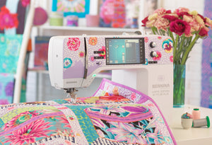
At High Country Quilts, our team genuinely loves helping quilters build beautiful palettes. Bring in your pattern, and let's have fun finding the perfect fabrics for your next project. You can explore our amazing selection online or come see us in Colorado Springs! Find your next inspiration at https://hcquilts.com.
At High Country Quilts we care deeply about community. With our experiences in retail, we know that a store is not only a place to shop but also a place for the community to gather and share. During this busy...

Hi! We’re Adam and Renee Wheaton, the new owners of High Country Quilts! For more than 40 years, we’ve owned and operated vacuum and sewing businesses. Following in Renee’s father’s footsteps after he retired from All Discount Vacuum and Sewing in Colorado...


Leave a comment