
We Love Our Quilting Community
At High Country Quilts we care deeply about community. With our experiences in retail, we know that a store is not only a place to shop but also a place for the community to gather and share. During this busy...


You pick fabrics you love, lay them on the table, and feel sure the quilt will be striking. Then the blocks are sewn, you step back, and the design looks blurry instead of bold. That happens to beginners all the time, and it usually isn't because the colors are “wrong.”
It's because the contrast isn't doing enough work.
When quilters talk about high-contrast quilt fabric sets, they're usually talking about more than bright color or dramatic prints. They're talking about whether each fabric has a clearly different value, meaning how light or dark it reads. Once you learn to audition fabrics for value before you buy or cut, choosing a fabric pull gets much easier.
A quilt can use beautiful fabrics and still look muddy. The usual culprit is that the fabrics are too close in value, so the block shapes don't separate clearly.
That matters most in piecing with repeated geometry, appliqué, and borders. If your fabrics don't separate, your pattern has to work harder to be seen. If they do separate, the design reads almost instantly.

Think of value as a grayscale ladder. Some fabrics read light, some medium, and some dark. A red and a green can have similar value even though they're very different colors. A floral and a solid can also blend together if they sit in the same value range.
Quilting educators consistently recommend using a full spread of values, light, medium, and dark, because that's what helps quilt motifs read clearly from a distance. One quilting guide also notes that relying only on light and dark pairings can make a quilt look dull, while balancing light, medium, and dark creates better contrast in the finished design, as explained in this guide to using value to create contrast in quilt designs.
Practical rule: If your block still makes sense from across the room, your values are probably doing their job.
Beginners often assume high contrast means black and white only. Black and white is certainly dramatic, and it's often the most extreme pairing. But high contrast can also come from a thoughtful spread of values and from color relationships that separate clearly.
Here's a simple way to think about fabric roles:
If you skip the middle, the quilt can become harsh or oddly flat at the same time. That sounds contradictory, but you'll recognize it when you see it. The blocks look busy up close and underdefined from a distance.
Say you're making a star block. If the background, star points, and center all sit in similar medium values, the star can disappear. If the background is light, the points are dark, and the center is medium, the eye can read the shape immediately.
That's why High-contrast quilt fabric sets are so useful. They give structure to the design before you sew a single seam.
If you want to browse fabrics with this idea in mind, looking at curated high-contrast quilt fabric sets and coordinating fabrics can help you train your eye before you commit to a project.
Understanding value on paper is one thing. Seeing it quickly in a fabric shop is another.
The good news is that you don't need advanced color theory. You need a few repeatable habits.

One of the most reliable ways to test a fabric pull is to take a phone photo and convert it to black and white. That shows whether the fabrics separate into light, medium, and dark values, because value contrast, not hue alone, is what drives readability in the finished quilt, as described in this article on choosing fabric for improv quilts.
Lay the fabrics side by side, snap the photo, then remove the color. If two prints that looked different in person turn into nearly the same gray, they probably won't create much definition once cut into pieces.
If the fabrics merge in grayscale, your block may merge too.
When you don't want to take every bolt to a design wall, use quick checks:
A lot of confusion starts because shoppers judge fabrics individually. Quilts aren't viewed one fabric at a time. They're read as relationships.
Large prints, stripes, and dense motifs can interfere with contrast if the print detail competes with the block shape. Sometimes the value is fine, but the print scale is so active that the piecing loses clarity.
That's why I tell new quilters to audition small cuttable areas, not just folded fabric. Ask yourself, “Will this still read once it becomes a patch?”
For visual learners, tools outside quilting can help too. Studying simple contrast in everyday design, even something as basic as the trim on a lightweight cotton t-shirt, can sharpen your eye for how edge definition changes the whole look of an object.
You're standing in the shop with six fabrics in your arms. Each one looks great alone. Then you hold them together and suddenly it gets murky. Which one leads, which one supports, and which one is just extra noise?
That is the moment to audition, not guess.
Once you can spot contrast, the next step is building a palette that still works after cutting. I suggest giving each fabric a job before you buy yardage. That simple habit keeps a fabric pull from turning into a collection of unrelated favorites.
I use three roles: hero, helper, and background.
For newer quilters, precuts make auditioning easier. A fat-quarter bundle gives you enough surface area to fold, layer, and mock up a few block combinations before you commit to larger cuts, which is why many quilters begin with fat-quarter bundles.

A bundle also gives you room to test the part many quilters skip. Put two or three fabrics side by side. Fold one corner back to reduce the visible print. Lay your possible background next to them. You are checking the relationship, not judging each fabric on its own.
If you shop by collection, a curated bundle from High Country Quilts can make that auditioning process simpler because the fabrics are already grouped in a way that is easy to compare before you buy full yardage.
This method works like casting a play. One fabric gets the spotlight, a few support the scene, and one keeps everything readable.
| Role | What it does | What to look for |
|---|---|---|
| Hero fabric | Sets the mood | A print or color you want to feature |
| Helper fabrics | Support the hero | Fabrics that shift lighter or darker without fighting for attention |
| Background fabric | Creates separation | A steady base that lets shapes stay clear |
Here is the useful test. If you cover the hero fabric with your hand, the helpers and background should still make sense together. If they don't, the palette is probably relying too much on one exciting print.
A black-and-white palette can be striking, but many quilts read more clearly when you include one middle-value fabric to soften the jump between light and dark.
Color theory sounds abstract until you put fabric on the table. Then it becomes practical.
Try this in the store or at home:
That last step saves money.
Many disappointing fabric pulls happen because quilters buy for possibility instead of readability. Auditioning helps you see what the quilt will ask the fabric to do.
Solids usually give the eye a place to rest, and their value is easier to judge quickly. Prints add energy, but they need breathing room. If every fabric has a lot to say, the block shape can get lost.
A simple mix often works well: one strong print, one quieter print, one or two solids, and a background that clearly separates the patchwork.
If you like to sketch ideas before shopping, tools outside quilting can help you test mood and grouping. Color schemes for marker artists is one example. It is useful for trying combinations on screen before you start pulling fabric, but your final decision still happens with real fabric side by side.
A strong palette keeps working after the fabric is cut into pieces.
The biggest mistake with high-contrast quilt fabric sets isn't choosing too little contrast. It's assuming that more contrast always solves the problem.
Sometimes it makes the quilt feel harsh. Other times it flattens the design because everything is pushed to the extremes.

A common pitfall is assuming the darkest or lightest fabric is always best. If every fabric sits at the extreme ends of the value scale, the quilt can lose depth, and many quilters solve that by adding at least one medium-value fabric to preserve hierarchy.
That medium is often the difference between “graphic and clear” and “stark but confusing.”
Think of medium values as connectors. They soften abrupt jumps and help repeated blocks feel intentional instead of choppy.
Two fabrics can have excellent value contrast and still clash once sewn. That usually happens when both prints demand attention.
Use this quick audit before you cut:
More contrast isn't always better. Sometimes subtle fabrics create depth and movement more effectively than a stark pairing.
Ask these questions before buying yardage:
If your palette feels close but not quite right, a few blender fabrics for quilting can help fill the value gaps without introducing another dominant print.
Good fabric selection gets most of the attention, but sewing choices affect the final look too. Thread, stitch visibility, and machine control all show more clearly in high-contrast quilts.
That's why a fabric pull that looked balanced on the table can start looking fussier after piecing if the sewing details fight the design.
In quilting-specific thread selection, many quilters choose a thread that's several shades lighter than the dominant dark fabric, or use a finer thread weight such as 60 wt or 80 wt to soften the look of the seam line. The goal is to keep the fabric relationship front and center instead of making the stitching line the loudest element.
Very dark or very light thread isn't always the answer. On black, red, or white fabrics especially, a hard-contrast thread can draw attention to every seam.
A simple guideline helps:
High-contrast quilts are less forgiving of wobble at points and intersections because the fabric changes are so visible. Precise feeding and consistent stitch formation help your blocks stay crisp.
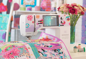
That's one reason some quilters compare machine features carefully before investing. If you're researching options, BERNINA sewing machines are one category many shoppers look at for stitch control, training support, and accurate piecing.
Contrast isn't created only through light and dark value. Modern quilt design also uses complementary colors, warm-and-cool pairings, and print scale to shape the final effect, as discussed in this overview of fabrics and color contrast in quilting.
That's useful to remember when a quilt feels slightly off. The problem may not be value alone. It could be that the print scale is too similar, or the warm and cool fabrics are pulling against each other in a way you didn't expect.
If you're still building confidence, start with simple blocks that show contrast clearly, such as stars, half-square triangle layouts, or bold modern patchwork. A hands-on quilting class in Colorado Springs can also make fabric auditioning easier because you get feedback before you cut into your favorite prints.
If you'd like help choosing fabrics, comparing machine options, or finding a beginner-friendly class, visit High Country Quilts. It's a practical next step when you want to turn a pile of fabrics into a quilt that reads clearly and feels intentional.
At High Country Quilts we care deeply about community. With our experiences in retail, we know that a store is not only a place to shop but also a place for the community to gather and share. During this busy...

Hi! We’re Adam and Renee Wheaton, the new owners of High Country Quilts! For more than 40 years, we’ve owned and operated vacuum and sewing businesses. Following in Renee’s father’s footsteps after he retired from All Discount Vacuum and Sewing in Colorado...


Leave a comment