
We Love Our Quilting Community
At High Country Quilts we care deeply about community. With our experiences in retail, we know that a store is not only a place to shop but also a place for the community to gather and share. During this busy...


Welcome to the world of quilting, where a simple pattern can become a true work of art just by the fabrics you choose. If you've ever wanted to move beyond guesswork and create quilts that really sing, understanding color theory for quilters is your secret weapon. It’s all about learning why certain colors play so well together, giving you the confidence to build amazing palettes from the ground up.
We’ve all been there: standing in a fabric store, surrounded by a sea of beautiful bolts, completely overwhelmed. You have a great pattern, but the fear of picking the “wrong” colors can freeze you right in your tracks. This guide is here to turn that fear into creative confidence by taking the mystery out of color.
Think of color theory less like a stuffy set of rules and more like a trusty toolkit for telling your story with fabric. It’s the language that explains why some fabric pulls feel calm and serene, while others practically buzz with energy. Honestly, learning these fundamentals is one of the most powerful skills you can add to your quilting arsenal.
Consider this guide your roadmap. We'll break down the big ideas into simple, practical steps you can use right away. We'll cover everything from the basic color wheel to the game-changing role of value and contrast in making a design work.
You’ll learn real techniques to:
Our goal isn't just to teach you rules, but to help you build an intuitive feel for color. You'll learn to trust your creative instincts because they'll be backed by a solid foundation of color knowledge.
By the time you're done here, you’ll be able to walk into any quilt shop, including our own at High Country Quilts, with a clear vision. It’s time to stop guessing and start designing quilts that show off your unique style. Let’s get started
Think of the color wheel as your ultimate cheat sheet for quilting. It's not a set of rigid rules, but a simple, visual guide that shows how colors play together. Once you get the hang of it, you can stop second-guessing your fabric pulls and start choosing palettes with purpose. Every gorgeous quilt, whether it’s loud and proud or soft and subtle, starts with the relationships on this wheel.
At its core, the color wheel is surprisingly simple. It’s all built from just three essential colors.
Primary colors are the parents of every other color on the planet. For our fabric stashes, we’re talking about red, yellow, and blue. You can't mix other colors to create these three; they're the true originals. A quilt made with just these three will feel bold, energetic, and often a little playful. They have an undeniable visual punch.
From these three powerhouses, we can mix a whole new world of color.
When you mix two primary colors, you get a secondary color. Think of them as the children of the primaries, and they sit right between their "parents" on the wheel:
These six colors—the three primaries and three secondaries—form the foundation of so many classic and modern quilts. A quilt that dances between all six is almost always vibrant, balanced, and full of life.
This is where the magic really starts to happen. As you can see below, your color choices are what give a quilt its energy, its sense of harmony, and its unique story.

This map is a great reminder that every fabric you pull is a creative decision that shapes the entire feel of your finished project.
Ready to add a little more sophistication? That’s where tertiary colors come in. You create them by mixing a primary color with one of its next-door-neighbor secondary colors. This gives us those beautiful "in-between" shades that add so much depth.
Their names are simple—just a combination of their parents, like red-orange, yellow-green, or blue-violet. These are your secret weapons for creating smooth color fades and complex, interesting palettes. They act as the bridge between the bolder primary and secondary colors.
Understanding how these colors communicate is what makes a quilt speak. It’s not just in quilting; for a fascinating look at how this works in a different context, you can explore the meaning behind colors used in graduation ceremonies.
Now that you know the basics of the wheel, you can start using it to create foolproof color combinations, often called harmonies or schemes. These are tried-and-true formulas that just work.
Here’s a quick-reference table for some of the most popular color schemes you'll encounter.
| Color Scheme | Description | Best For Creating |
|---|---|---|
| Monochromatic | Using different tints, tones, and shades of a single color. | A calm, sophisticated, and cohesive look. Think of a blue-and-white quilt. |
| Analogous | Using 2-4 colors that are next to each other on the color wheel. | A harmonious and serene feel. Great for creating a smooth color wash. |
| Complementary | Using two colors that are directly opposite each other on the wheel. | High-contrast, vibrant, and energetic designs. Think red and green. |
| Triadic | Using three colors that are evenly spaced around the color wheel. | A balanced yet dynamic and playful palette. |
| Split-Complementary | A base color plus the two colors adjacent to its complement. | High contrast like complementary, but with less tension. A quilter's favorite! |
Using these harmonies as a starting point is one of the best ways to build confidence when pulling fabrics for your next project.
Have you ever spent weeks piecing a quilt, only to have the design get lost once it's all sewn together? Maybe you’ve looked at a finished top and felt it was just a bit… flat? If your beautiful colors seem to be blurring into a single muddy puddle, the ingredient you’re missing isn’t a new fabric—it's value.
Simply put, value is the lightness or darkness of a color. Think of it as a spectrum from pure white to jet black. Every single fabric in your stash, no matter the color, has a place somewhere on that scale. In the world of color theory for quilters, understanding value is probably the single most important skill you can develop. It’s what gives a quilt depth, sparkle, and that undeniable "wow" factor.

Color (or hue) gets all the glory. We gush about our love for certain blues or our stash of perfect greens. But when you’re actually designing a quilt, it's value that’s doing most of the work behind the scenes.
A quilt with a good range of values—from whisper-light to deep and dark—will always have more life than one made with a dozen colors that are all the same medium value. When two fabrics with similar values sit side-by-side, our eyes just can't see the line between them clearly. That medium pink and medium green might look totally different on the bolt, but if their values are too close, the shapes you worked so hard to cut and sew will just melt into each other.
Strong value contrast is what makes your pattern readable from across the room. It’s what defines the design.
So how do you get better at seeing value instead of being dazzled by color? Luckily, there’s a simple trick that uses a tool you already carry everywhere: your smartphone.
Taking a picture of your fabric pull in black and white is a total game-changer. Just lay your fabrics out on a design wall or even the floor, and snap a photo using a black-and-white or monochrome filter. It instantly strips away the distraction of color, revealing the true value of every piece.
Looking at your fabrics in grayscale is like having X-ray vision. You can immediately see where your quilt is lacking contrast. If two fabrics turn into the same shade of gray, you know their values are too similar to stand out against each other.
Once you start seeing in grayscale, you can use value to your advantage. The goal is to build a quilt with a healthy, well-distributed mix of lights, mediums, and darks.
Here’s a simple way to do it:
This little trick is especially crucial for intricate blocks, like stars or log cabins, where the magic really happens in the interplay between light and dark fabrics.
This isn’t just a hunch; the power of value is well-known among seasoned quilters. Some experts estimate that value is responsible for as much as 70% of a quilt's visual impact. It’s often more important than the actual color. This is the principle that makes a mid-tone blue look 20-30% darker when you place it next to a crisp white. Once you learn to control these effects, you can create incredible depth. To see how these ideas have evolved, you can explore the history of fabric and color use in quilting.
A great habit to get into is thinking about value while you're shopping. Don't just buy the colors you love; buy a range of values within those colors.
When you build a stash that's balanced in both color and value, you're setting yourself up for success. You'll always have the tools on hand to create stunning, eye-catching quilts and ensure your hard work shines.
Alright, you've got the basics of color relationships and value under your belt. Now for the best part: pulling fabric! This is where all that theory turns into a beautiful, tangible stack of possibilities right in front of you. Instead of feeling paralyzed by endless choices at the fabric store, you can now use classic color schemes as your creative roadmaps.

Let's translate those color wheel harmonies we talked about into actual quilt palettes. These four schemes are fantastic starting points for any quilter, whether you're a seasoned pro or just starting out, and they'll help you build a cohesive and stunning fabric pull every time.
Here are four reliable ways to build a palette, each creating a completely different mood, from calm and serene to bold and energetic.
A Quilter's Best Friend: The Hero Fabric Hands down, the easiest way to build a flawless palette is to start with one fabric you absolutely adore—your "hero fabric." Find a multi-color print that tells a clear color story. Then, all you have to do is pull coordinating fabrics by matching the individual colors within that print. It’s a nearly foolproof trick for a professional, cohesive look.
So you've chosen your colors. Now, how much of each should you use? A brilliant guideline borrowed from interior design is the 60-30-10 rule. It's a simple ratio that helps create a balanced and visually satisfying quilt top.
Here’s how it works:
This simple rule is great for preventing any one color from completely taking over your design, ensuring your quilt feels balanced and intentional, not chaotic.
Finally, let's talk about the true workhorses of the quilting world: neutrals. Colors like cream, beige, gray, charcoal, and even a soft black are absolutely essential tools. They give the eye a place to rest, which in turn allows your more vibrant colors to really shine.
Think of neutrals as the gallery walls for your colorful patchwork. A quilt packed with only bright, saturated colors can quickly feel overwhelming and busy. Neutrals, on the other hand, create contrast, help define shapes, and bring a quiet sophistication to your work. A well-placed neutral sashing or background can be the one thing that ties an entire quilt top together, making it feel polished and complete. Never underestimate the power of a good gray or a warm cream to elevate your design from nice to knockout.
So far, we've been talking about color theory using neat and tidy solid fabrics. But let's get real—most of us aren't quilting with a sterile set of color chips. We're working with a glorious, chaotic stash of floral prints, geometric precuts, and that ever-growing scrap bin. This is where applying color theory for quilters gets really fun, turning that beautiful mess into a cohesive masterpiece.
Prints and scraps don't play by the same simple rules as solids. Each one brings its own personality to the party with multiple colors, different scales, and unique textures. The trick isn't to force them into submission but to learn how to let them sing together. It's about looking beyond a single color and seeing the overall impact each fabric brings to the design.
Ever fall head-over-heels for a gorgeous, large-scale print at the fabric store, only to get it home and find it completely takes over your quilt? I’ve been there. These "busy" prints just need a little breathing room, and the secret is to surround them with fabrics that let them shine without competing.
Think of it like a lively conversation. If one person is telling a vibrant, exciting story (your busy print), everyone else needs to lean in and listen (your supporting fabrics).
Scrap quilts are the ultimate playground for your color theory skills. The goal is to create something that looks intentionally "scrappy happy," not just like a jumbled mess. Your most powerful tool to achieve this? Value. Sorting your scraps by value is far more important than sorting by color. A quilt made from a pile of scraps that are all medium-value will look flat and muddy, no matter how many pretty colors are in there.
By simply sorting your scraps into three piles—light, medium, and dark—you create the essential building blocks for contrast. This one step will give even the most random assortment of fabrics the structure and sparkle it needs to come alive.
This tradition of turning scraps into art is woven into our quilting heritage. Quilting has come a long way since the simple earth tones of Colonial America. After the 1920s, the rise of "feedsack quilts" brought a burst of color, as women repurposed and traded sacks to get the bold reds, blues, and yellows they wanted. It's a beautiful story of making art from necessity. You can explore more of this fascinating journey through the history of color in quilting on carolinaoneto.com.
Before you even think about picking up your rotary cutter, you need to "audition" your fabrics. How fabrics look neatly stacked on your cutting table is completely different from how they'll look cut up and stitched together. A design wall is perfect for this, but a clean spot on the floor or a large piece of batting pinned to the wall works just as well.
Lay out your fabric choices in a way that roughly mimics your quilt pattern. Now, step back—way back. Squint your eyes to blur the details. Then, pull out your phone and snap a quick black-and-white picture. This little routine helps you see what’s really going on.
This auditioning process is where your knowledge of color theory for quilters truly comes to life. It’s your chance to troubleshoot your fabric pull before you start cutting, saving you a world of frustration and helping you create the stunning quilt you pictured in your head.
Feeling that creative spark? You’ve just armed yourself with some powerful tools—you know your way around the color wheel, you understand why value does all the heavy lifting, and you have the secrets to building stunning palettes. Now for the best part: turning that theory into a tangible quilt top.
This is where the magic happens, but the best way to make it stick is to start small. Forget about that king-sized masterpiece for a moment. Instead, think about a pillow cover, a table runner, or a mini quilt. A low-stakes project gives you the freedom to play without a huge commitment of time or fabric.
Treat this first small project as your personal color laboratory. It's the perfect chance to finally try out that bold color scheme you've been eyeing or to build a whole palette around a single "hero" fabric you absolutely adore.
As you start pulling fabrics, keep a few things in the front of your mind:
Remember, the goal here isn't perfection; it's practice. Every piece you cut and every seam you sew is building your color confidence. This is how you find your own unique quilting voice.
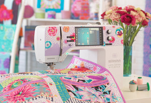
Getting comfortable with color is a huge milestone, and you don’t have to go it alone. The quilting community here at High Country Quilts is always here to cheer you on. Stop by our Colorado Springs shop to play with our fabric selection and see how new combinations look together on our design walls.
Our staff lives and breathes color and we'd be thrilled to help if you ever feel stuck. Your adventure in confident quilting is just getting started, and we can’t wait to see what you create.
As you get more comfortable with quilting, you'll naturally start having more questions. Learning to apply color theory is a skill that really does grow with every single quilt you make. To help you navigate those tricky spots, I've put together answers to some of the most common questions I hear from quilters trying to get more confident with their fabric choices.
Think of this as your go-to guide for those real-world quilting problems. From figuring out the perfect background to rescuing a quilt that’s looking a little "muddy," these answers should help you troubleshoot and, more importantly, build your own creative intuition. Let's dig into these common color conundrums.
The best background is always the one that lets your main colors and patterns shine. The real secret here is value contrast. If your quilt top is full of vibrant, saturated colors, a background that’s either really light (high-value) or really dark (low-value) will create that crisp, defining edge your piecing needs.
Neutrals are your best friend here. Think cream, soft black, or a whole spectrum of grays. They’re fantastic choices because they don’t fight for attention. Instead, they act like a quiet stage, letting your colorful "star" fabrics take the spotlight.
The most foolproof way to know for sure? Test it before you cut. Lay a finished block or even just a few key fabric swatches on top of your potential background. Step back a few feet, and snap a quick black-and-white photo with your phone. It's an old-school trick that works every time—it will instantly show you if there's enough contrast to make your design pop.
The key to preventing a scrap quilt from descending into chaos is to give it a unifying element that holds everything together. The simplest and most effective way to do this is by controlling the value. Using a consistent light background or a dark sashing fabric will visually anchor all those different scraps, making the whole quilt feel cohesive and planned.
Another tried-and-true strategy is to sort your scraps into color families. Grouping all your blues, greens, or yellows lets you create a more structured design, like a beautiful rainbow gradient or an ombré quilt. This approach feels intentional and organized—not just random—and it’s how you can turn a pile of leftovers into a harmonious masterpiece.
By focusing on either a consistent value or a clear color progression, you give the viewer's eye a logical path to follow. This simple trick turns a potentially messy scrap bin into a well-designed work of art.
First off, you didn't do anything wrong! A "muddy" quilt is almost always the result of one thing: a lack of value contrast. This is a super common issue that happens when most of the fabrics you picked fall into that same medium-value range. Without the punch of some very light and very dark pieces, the colors just kind of blend together, and the pattern gets lost.
The good news is, it’s often fixable! The solution is to inject more contrast. Try adding a very dark inner border or a very light sashing between your blocks to help define them and give them some breathing room.
Sometimes, even just strategically swapping out a few of those medium-value pieces for much lighter or darker ones can bring the entire design into sharp focus. A small edit like this can breathe new life into a quilt that feels a little flat.
Getting out of a color rut is all about taking small, guided steps. A fantastic way to start is by finding a "bridge fabric." This is a multi-color print that includes a color you rarely use right alongside colors you already know and love. Let that one print be your guide for the entire palette.
Another great trick is to use the color wheel to intentionally try a scheme you've never worked with before, like a split-complementary or triadic harmony. It gives you a clear formula to follow, which takes a lot of the guesswork and anxiety out of the process.
And finally, look for inspiration in what other quilters are doing! Visiting a local quilt shop or a guild meeting can expose you to bold combinations you’d never have thought of on your own. Seeing the incredible work others are creating is often the spark of confidence you need to try something new and exciting yourself.
Ready to put some of these ideas into practice? The best way to build color confidence is to get your hands on beautiful fabrics. Stop by High Country Quilts in Colorado Springs to explore our curated selection and find the perfect palette for your next masterpiece. Start your color adventure with us today!
At High Country Quilts we care deeply about community. With our experiences in retail, we know that a store is not only a place to shop but also a place for the community to gather and share. During this busy...

Hi! We’re Adam and Renee Wheaton, the new owners of High Country Quilts! For more than 40 years, we’ve owned and operated vacuum and sewing businesses. Following in Renee’s father’s footsteps after he retired from All Discount Vacuum and Sewing in Colorado...


Leave a comment