

We Love Our Quilting Community
At High Country Quilts we care deeply about community. With our experiences in retail, we know that a store is not only a place to shop but also a place for the community to gather and share. During this busy...


You're standing in a fabric shop with a beginner's pattern in one hand and a wall of soft pink bolts in front of you. One print has tiny blossoms scattered across a cream ground. Another shows dramatic branches, while a third has a glossy, silk-like surface that looks beautiful but feels less forgiving. They all say “sakura,” yet they won't behave the same way in a quilt.
Cherry blossom fabrics become much easier to choose once you look beyond color. The petal shape, motif scale, ground fabric, weave, dye method, and companion patterns all influence the finished project. The motif also carries a long Japanese textile history, where blossoms could suggest spring, celebration, impermanence, and carefully composed seasonal scenes.
By the time you finish, you'll know how to read a sakura print, select a beginner-friendly fabric, build a calm supporting palette, test a delicate pink before cutting, and choose a project you can complete. You'll also have a clearer sense of when a small blossom print belongs in the background and when a large branch deserves the center of the quilt.
A first quilt often begins with a feeling rather than a plan. You see a cherry-blossom fabric and immediately imagine a baby quilt, a spring table runner, or a soft throw folded over a reading chair. Then the practical questions arrive. Will the pink bleed? Is the print too busy? What should go beside it? Does the fabric need special care?
The easiest way to settle those questions is to give the sakura print a job. A small tossed blossom can act as a background, helping larger shapes stand out. A branch with widely spaced flowers can become the focal fabric. A pale pink solid may calm the design, while a dark brown, blue, or muted green can give the blossoms somewhere to rest.
Practical rule: Choose the fabric for the role it will play in the quilt, not just for the color you love on the bolt.
Cherry blossoms are more than a generic spring decoration. In Japanese textile traditions, the motif has been used in formal garments, everyday clothing, woven textiles, dyed fabrics, and pictorial compositions. That history gives modern quilters a useful design vocabulary. You can combine sakura with clouds, waves, birds, maples, or quiet geometric blenders without making the quilt feel random.
For a first project, keep the construction simple and let the fabric provide the interest. A straight-pieced runner, a small patchwork throw, or a one-block design gives you room to learn accurate cutting, consistent seams, pressing, and quilt finishing. The finished piece can still feel thoughtful because the fabric choices carry the story.
Look for a print that makes you want to sew today, then check its fiber content and scale before buying. That small pause turns an impulse purchase into a workable plan.
Cherry-blossom fabric has deep roots in Japanese clothing and decorative arts. Japanese kimono construction developed from the kosode, which became common clothing for men and women across social classes during the 17th century. Garments from this tradition used embroidery, resist dyeing such as shibori, patterned weaving, and painted or dyed decoration, creating many ways for floral imagery to enter the textile itself. The Metropolitan Museum of Art documents cherry-blossom motifs on Japanese textiles from at least the Edo period, including a 19th-century plain-weave asa cloth with warp-and-weft kasuri, or ikat, patterning. Its collection also includes an 18th-century formal outer kimono, or uchikake, with sakura imagery, showing that blossoms belonged in ceremonial clothing as well as seasonal goods. The Metropolitan Museum of Art's textile record offers a useful visual reminder that the motif was never limited to modern printed cotton.
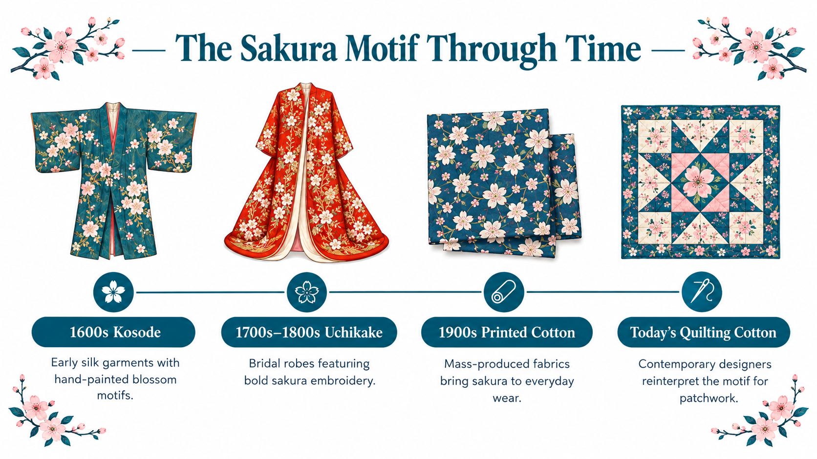
Cherry blossoms traditionally signal spring, but their meaning can extend toward renewal, celebration, fragility, and the fleeting nature of life. A Meiji-period furisode in the Metropolitan Museum's collection pairs cherry blossoms with blue hydrangeas associated with June, creating a calendar-like composition rather than a single-season snapshot. An official Japanese cultural publication describes an Edo-period uchikake made from glossy rinzu silk satin damask, with blossoms among clouds and bamboo blinds, plus a crane associated with longevity and good fortune. The museum record for the Meiji-period garment shows how several symbols can share one pictorial textile.
That principle translates beautifully to quilting. A sakura print doesn't need to stand alone. You might pair it with a crane or cloud motif for a more formal mood, or use waves and soft blue for movement. The Kyoto Museum of Traditional Crafts identifies Nishijin-ori as a major woven textile used for kimono and obi, while Kyo-Yuzen is known for compositions of seasonal flowers, trees, and birds influenced by traditional Japanese painting. The Kyoto Museum's overview of traditional crafts can help you see why scale and placement matter as much as color.
Start with the blossom itself. Traditional sakura imagery is often recognizable by its five-notched petals, though commercial fabrics may simplify or stylize that shape. Look next at the branch. A dark, angular branch creates structure and contrast, while a thin, curving branch gives the print a lighter, more delicate feeling.
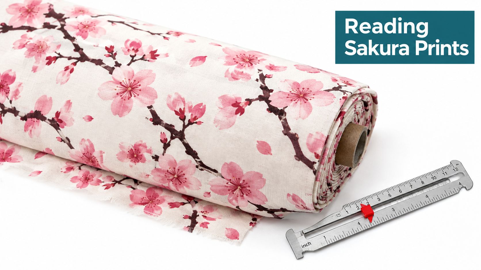
Hold the bolt at the distance where you'll usually see the finished quilt. Tiny blossoms that merge into a soft texture are excellent for sashing, narrow borders, background patches, or scrappy blocks. Large isolated flowers need more room. If you cut them into small squares, you may lose the petal shape or create awkward partial blossoms.
A large branch can work in a focal block, a medallion center, or an appliqué-inspired arrangement. A tossed print usually has more flexibility because every cut looks different without demanding careful placement.
The background behind the blossom may be just as important as the blossom itself. Cream and warm ivory create a quiet, traditional feeling. White gives sharper contrast. Pale blue suggests sky or water, while charcoal, navy, or brown makes the pink appear brighter and more graphic.
Companion motifs can add meaning, but they also add visual information. Hydrangeas, butterflies, birds, pine, plum, clouds, and waves may appear with sakura in historically informed compositions. That doesn't mean every motif belongs in every quilt. Use one busy seasonal print as the focal point, then let the supporting fabrics repeat only a color or a simple shape.
Look closely: A calm quilt usually has one dominant story, not a dozen equally loud patterns.
Before you cut, spread the fabrics together and step back. If your eye lands on three different prints at once, replace one with a blender or soft solid. Design becomes easier when each fabric has a clear role.
The phrase “cherry blossom fabric” describes a design family, not one performance category. A cotton print, a batik, silk-inspired yardage, and a naturally dyed cloth can all feature sakura, yet they differ in feel, stability, care, and suitability for a first quilt.
| Fabric Style | Fiber & Hand | Beginner Friendly | Best Projects |
|---|---|---|---|
| Printed quilting cotton | Usually a stable woven cotton with a predictable hand and printed surface | Most forgiving for cutting, piecing, pressing, and routine washing | Patchwork throws, table runners, tote bags, pillows, and beginner quilts |
| Batik | Often a firmly woven cotton with color integrated through a resist-dye process; the hand may feel slightly crisp | Friendly with planning, especially when the fabric has a clear right and wrong side | Geometric quilts, contrast blocks, borders, and projects needing saturated color |
| Silk-inspired yardage | May be silk or a synthetic with more sheen, drape, and movement than quilting cotton | Less forgiving because slippery fabric can shift and may need stabilizer | Accent panels, garments, decorative pillows, art quilts, and special-occasion pieces |
| Hand-dyed or naturally dyed cloth | Fiber and structure vary widely; color can show subtle variation between batches | Best after swatch testing and careful handling | Art quilts, heirloom accents, small panels, and projects where surface character matters |
A printed quilting cotton is the sensible starting point when you're learning. It generally holds its shape well and makes straight seams easier to control. Batik can also work beautifully, but its dense color and directional surface may change how you judge contrast.
Silk and silk-like fabrics bring drape and light. They can make a small wall hanging or cushion feel special, but they're not automatically the best choice for a first patchwork throw. A stabilizer or interfacing may help prevent stretching, though you should test the combination before committing to the project.
Naturally dyed fabric deserves particular care. Sakura-zome traditionally uses cherry twigs or bark rather than flower petals, and color development depends on extraction time, oxidation, mordant choice, and when branches are collected. One documented process allows the dye liquor to oxidize for approximately one week, with aluminum producing shades from yellow through cherry red, copper producing brown, and iron producing purplish-gray through silver-gray. This overview of sakura dyeing explains why artisan colors can vary and why the word “sakura” on a label doesn't prove a particular dye source.
Choose quilting cotton for confidence, then explore more delicate materials when you know how the fabric behaves.
A small patchwork project gives cherry blossoms enough room to shine without turning your first sewing experience into a wrestling match. A charm-square throw, a simple block quilt, or a one-block table runner all rely on straight seams and repeatable units. The best choice is the one whose finished size matches your patience, sewing space, and available cutting time.
Start with a swatch. Cut a small piece from each fabric, label the fiber content if it's known, and wash the sample according to the most delicate care requirement. Press it after drying and check whether the print, weave, or hand has changed.

Don't chase perfect points at the expense of finishing. Your first sakura project should teach you how fabric responds, how pressing affects accuracy, and how color changes across a larger surface. A completed runner can build more confidence than an ambitious quilt that remains folded in a project basket.
If the cloth is silk, loosely woven, or naturally dyed, stabilize a test piece before cutting the actual yardage. That single experiment can prevent stretching, fraying, or unexpected color transfer later.
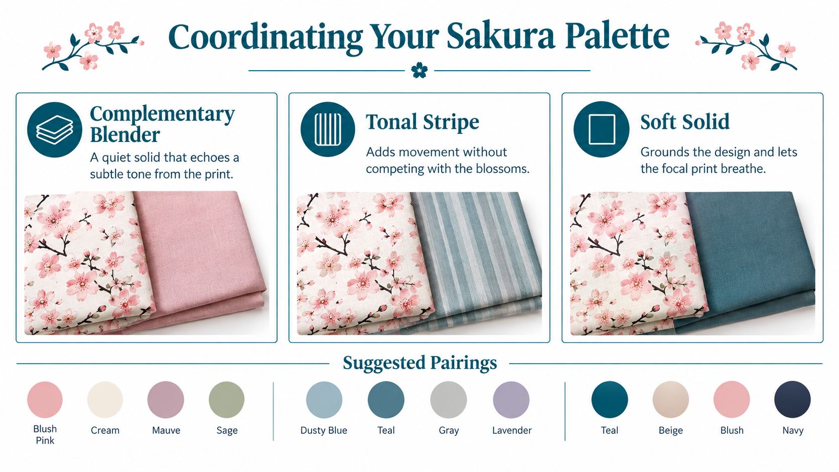
A sakura palette becomes easier when every fabric has a job. Begin with the focal print, then pull colors from it rather than guessing from memory. The branch might suggest brown or charcoal, the blossom may offer blush and white, and a small leaf detail may point toward sage or muted green.
Early-bloom blush works with pale pink, warm cream, soft gray, and a restrained brown branch. This combination feels gentle without becoming flat because the branch provides a firm visual anchor.
Full-bloom white and pink uses white blossoms, blush, stronger pink, and a cool blue or charcoal accent. The darker supporting color keeps the quilt from becoming a single pale wash.
Late-season green and cream pairs blossom pink with leaf green, ivory, and a bark-inspired neutral. It suggests the transition from flowering branches toward foliage and gives the quilt a more grounded appearance.
Use the print as the focal fabric, a blender as the quiet connector, and a solid as breathing room. A tonal stripe can guide the eye across a border or create movement between blocks, but it shouldn't compete with the blossom shapes.
Place the fabrics together in natural light, then take a quick photograph and view it in grayscale. If the focal print disappears into the background, increase contrast with a deeper neutral or a lighter solid. If every fabric has the same visual strength, remove one busy pattern.
The Japanese textile examples described earlier show how blossoms can share space with clouds, water, birds, or other flowers. For a quilt, you don't need to reproduce a historical composition. You can borrow its balance by pairing one organic sakura print with one geometric or textured fabric.
Design shortcut: Repeat one supporting color at least twice. Repetition makes a small palette feel intentional.
Pale pink doesn't automatically mean fragile. A fabric's durability depends more on its fiber, weave, print or dye process, and care instructions than on the blossom motif. Historical cherry-blossom textiles used silk, cotton, and hemp, with decoration ranging from hand printing to specialized dyeing, so the label “sakura” tells you about the visual theme, not the fabric's strength.
Printed quilting cotton is usually the easiest place to begin. Silk, silk-inspired yardage, loosely woven cloth, and hand-dyed material deserve a test before they enter a larger quilt.
If color transfers, don't automatically discard the cloth. You may be able to use it in a project with compatible colors, but you'll need a care plan that prevents surprises. Avoid combining an untested hand-dyed piece with pale fabric in a quilt that will be washed frequently.
Sunlight deserves attention after the quilt is finished. Store delicate pink quilts away from direct light and avoid displaying them in a spot where one side receives strong sun for long periods. Preserving the contrast between pale blossoms and dark branches is easier when the textile isn't exposed continuously.
A stabilizer or interfacing can support delicate silk or loosely woven fabric, but test the layered piece first. The wrong stabilizer can change the drape or make a soft fabric feel stiff.
Cherry-blossom quilts don't have to leave the room when spring ends. Their colors can feel fresh in a spring runner, tender in a gift quilt, calm in a bedroom throw, or celebratory in a wedding or memorial project. The motif's seasonal association gives the fabric a starting point, but your palette and pattern decide how the finished piece lives.
A year-round design might use a branch print with cream, charcoal, and muted green rather than a purely pink palette. A small blossom blender can disappear into a scrappy quilt, while a carefully framed panel can become wall art. The historical record also shows that cherry blossoms could appear in compositions intended for more than a single seasonal moment, so you don't need to treat every sakura project as temporary spring décor.
The Fukuoka Art Museum documents a 19th-century cotton costume from the Ryukyu tradition with drooping cherry sprays, streams, and irises on a yellow ground. Its exhibition material on cherry blossoms offers a strong design lesson for quilters: blossoms can be woven into a larger composition of water, flowers, mist, or contrasting ground rather than isolated as a repeating scatter.
The Japan Folk Crafts Museum likewise records a 19th-century cotton garment decorated with irises, flowing water, and cherry blossoms, alongside ramie with an ikat design. The museum's textile exhibition information supports a practical pairing: combine an organic sakura print with a stripe, blender, or ikat-inspired geometric to create texture and rhythm.
For project planning, consider the natural cycle behind the motif. Japan's blossom period extends across roughly four months as flowering moves from south to north, beginning in Okinawa in mid-January, reaching Tokyo around late March to early April, appearing in Tohoku during April, and typically arriving in Sapporo and Hakodate in early May. GO TOKYO's seasonal guide shows why a sakura palette can represent an extended season rather than a single date.
Peak bloom itself is brief. Blossoms generally reach full bloom about one week after the first flowers open, with the peak usually over roughly another week later as petals fall. Japan's national tourism authority describes the blossoms as lasting only about seven to ten days. Japan's official tourism announcement connects that fleeting cycle to a useful quilt palette: dark branches or bark as an anchor, pale pink and white at the center, and green or blue for leaves and spring sky.
Start with one bolt, one simple pattern, and one test swatch. If you'd like help choosing fabric, tools, or a beginner-friendly class in Colorado Springs, visit High Country Quilts to explore curated quilting fabrics, precuts, sewing supplies, and hands-on learning opportunities. Bring your sakura idea to the shop and turn that first beautiful fabric choice into a finished project you'll be proud to use or give.
At High Country Quilts we care deeply about community. With our experiences in retail, we know that a store is not only a place to shop but also a place for the community to gather and share. During this busy...

Hi! We’re Adam and Renee Wheaton, the new owners of High Country Quilts! For more than 40 years, we’ve owned and operated vacuum and sewing businesses. Following in Renee’s father’s footsteps after he retired from All Discount Vacuum and Sewing in Colorado...


Leave a comment