
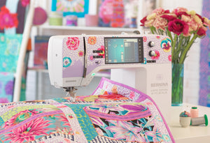

We Love Our Quilting Community
At High Country Quilts we care deeply about community. With our experiences in retail, we know that a store is not only a place to shop but also a place for the community to gather and share. During this busy...


Color blocking is a design technique that uses large, solid areas of contrasting color to create strong visual separation, often with two or three distinct colors rather than gradients or prints. In quilting, that means choosing fabric pieces whose clear color zones work together to shape the quilt's layout, emphasis, and balance.
You may have felt the pull of a modern quilt pattern that looks striking from across the room, then wondered how the maker chose colors that feel bold without becoming chaotic. The answer often begins with color blocking, a simple idea with deep roots in modern art and a very practical place in the sewing room.
For web publishing, use body copy of at least 16px, a comfortable baseline recommended by the U.S. Web Design System typography guidance. Older blog design research found body copy commonly clustered between 12 and 14 pixels, with 13 pixels the most popular size at 38%, so a larger setting improves the reading experience for today's audience. Keep header sizes visibly larger than body copy, adjust them downward on mobile, use comfortable body line spacing, and keep header line spacing tight enough to preserve hierarchy. This article belongs in a broader color blocking and modern quilting pillar, supported by a detailed color blocking product page.
A quilter scrolling through modern patterns may stop at a wall quilt made from a few large rectangles. There's no crowded floral print, no complicated sampler layout, and no obvious decorative trick. Yet the design catches the eye immediately because each color occupies a clear territory.
That's what color blocking does. It uses large solid areas of contrasting color to create separation and emphasis, so the viewer can understand the shape without studying every seam. In a quilt, a navy rectangle beside warm ochre and soft cream can communicate structure more clearly than several small prints competing across the same surface.
You can test the idea before buying fabric. Lay two or three bolts or fat quarters side by side and step back. If each one remains recognizable, while the group still feels related, you're already thinking like a color-blocking designer.
Solid fabrics make this especially approachable because they remove the extra decisions created by scale, motif direction, and print density. Your main task becomes placement:
Practical rule: If the color arrangement looks clear from across the room, the quilt's visual structure is probably doing its job.
The technique also helps beginners because the design can look polished without requiring tiny pieces or elaborate blocks. A simple grid, a few accurately cut rectangles, and deliberate fabric placement can create a finished quilt with a strong graphic identity.
Once you recognize the pattern, you'll notice the same logic in clothing, interiors, wall art, and patchwork. The blocks may change size or direction, but the principle stays steady: separate color zones create a readable composition. For project-specific fabric and pattern ideas, explore this color blocking quilting product detail page.
Color blocking didn't begin as a retail styling label. Its visual language grew from early twentieth-century modern art, particularly Piet Mondrian's Neoplasticism and the wider De Stijl movement. Mondrian's mature abstract works used primary colors, black, white, and straight horizontal and vertical lines, creating a disciplined system of separated planes. For a quilter, the lesson is immediate: a limited palette and a strong grid can produce energy without visual clutter.
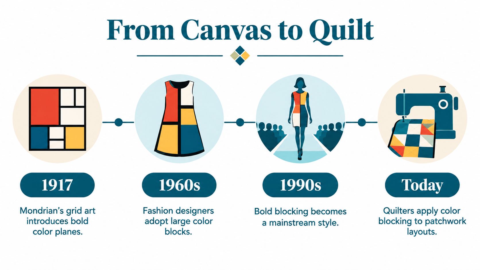
Color Field painting extended the same interest in expansive, flat areas of color. The American abstract movement was most active from the 1940s to the 1960s, demonstrating how a broad field of one color could carry visual weight on its own, as described in this history of color blocking. In fabric selection, that suggests looking beyond individual swatches and asking how a whole section of a quilt will feel when it occupies space.
Fashion made the idea more widely recognizable. Yves Saint Laurent's 1965 Mondrian dress translated separated color planes and black linear structure into a garment, helping turn block-color composition into a global style reference. The important sewing lesson isn't that a quilt should imitate a dress. It's that color placement can become part of construction, shaping how seams, panels, and proportions are understood.
The commercial revival later showed that the technique could move beyond art-world influence. One historical account places a peak in 2011, when search interest reached 100 in March 2011 after being near zero the year before, while retail sales of color-blocked clothing totaled over $2 billion in 2011. The overview of color blocking's fashion history connects that demand to the style's repeated appearances in fashion.
For quilters, this history explains why bold blocks feel both modern and familiar. You're not chasing a passing decoration. You're using a visual system that has repeatedly moved from painting into clothing and then into approachable sewn design.
Bold color doesn't automatically create disorder. Placement controls visual hierarchy, which means some areas attract attention first while others subtly support the composition. Brighter or lighter blocks tend to come forward, while darker or more muted blocks recede. In a quilt, that can make one rectangle feel like the focal point and another feel like a frame.
Think about arranging furniture in a room. A bright chair placed in the center becomes a destination for the eye, while a darker shelf along the wall feels more stable and less urgent. A color-blocked quilt works in much the same way. The fabric colors matter, but their size, position, and relationship matter just as much.
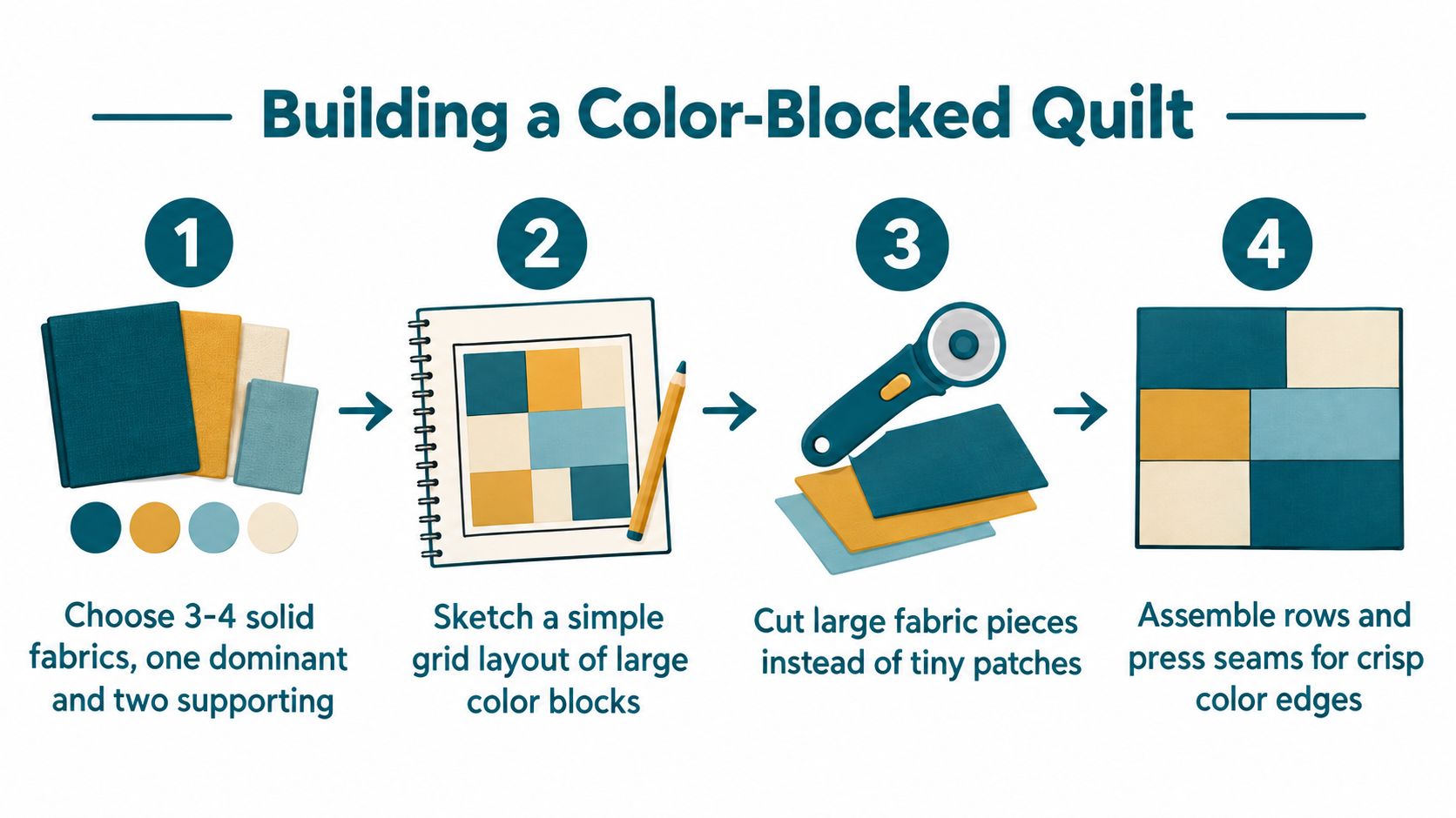
Before cutting, sketch the quilt as simple shapes and label each zone with a color. This prevents an attractive fabric bundle from turning into a random arrangement on the design wall.
A practical palette usually stays within two or three colors, with one tone neutral or muted. That recommendation matters because several saturated blocks can compete so strongly that the quilt loses cohesion, as explained in this guidance on colour blocking in fashion and design. A calm cream, charcoal, denim, or soft gray can give brighter fabric somewhere to rest.
You can also study how large artwork sits in a room before deciding where a bold quilt will hang. This resource on Colorado Art Services artwork placement offers useful spatial thinking about scale, visual weight, and placement. Those same questions help when deciding whether a strong block belongs at the center, along an edge, or in a quieter corner of a quilt.
Finally, choose solid fabrics with similar weight and drape. Matching materials keep seams flatter and help the finished piece remain structurally balanced, particularly where several blocks meet.
There isn't one correct way to build a color-blocked quilt. Your best starting point depends on how much contrast you enjoy, how confident you feel selecting fabric, and whether the finished project is meant for a wall, a lap, or a thoughtful gift.
| Approach | Visual impact | Fabric selection difficulty | Best use case |
|---|---|---|---|
| High-contrast modern | Crisp, graphic, and attention-grabbing | Moderate, because value differences must be intentional | Wall hanging or statement quilt |
| Saturated colors with neutrals | Softer, calmer, and easier to live with | Moderate, because the neutral must support rather than flatten the colors | Lap quilt or contemporary home project |
| Two-color starter | Clear, restrained, and forgiving | Lower, because fewer relationships need balancing | First quilt or handmade gift |
A two-color project gives you a clean way to learn how block size and seam alignment affect the finished design. Try a dark solid with a light solid, or choose two neighboring hues with a noticeable difference in value. You'll learn the central skill, intentional placement, without managing a large palette.
A neutral-based palette suits quilters who like modern design but don't want a loud result. Pair a saturated teal, coral, or mustard with cream, gray, or another muted tone, then let the neutral occupy enough space to create breathing room. This softer interpretation reflects the shift toward more wearable combinations that balance saturated color with neutrals, rather than relying only on brilliant contrasts, as noted in this definition and contemporary context for color blocking.
High contrast can come later. It's rewarding for a wall quilt where geometric clarity matters, but every fabric choice becomes more visible. Begin with the two-color approach, then experiment with larger color fields or a carefully chosen accent once you trust your eye.
For a focused project, browse this beginner color blocking product page before building your fabric pull.
Color blocking changes more than the appearance of a quilt. It changes where you cut, how you add seam allowance, and how carefully you align adjoining sections. Instead of treating a color change as decoration placed on top of a finished block, you build the change into the block itself.
If a design calls for a color division through the middle of a rectangle, separate the pattern piece at that line. Add seam allowance to both new edges, then sew the sections back together. This process turns the block into a manageable geometric puzzle, and accurate cutting keeps the final dimensions under control. A sewing guide to colour blocking describes this same construction principle for sewn projects.
Sewing-room advice: Accuracy matters more than speed. A carefully measured first block teaches you more than a rushed stack of pieces.
At an intersection, match the seam lines with pins or clips before sewing. If the points don't meet perfectly, don't assume the whole quilt is ruined. A small mismatch is normal while you're learning, and you can improve the next seam by checking the quarter-inch guide, reducing fabric movement, or pressing without stretching the piece.
Keep the first layout uncomplicated. Large blocks make color relationships easier to see, while similar fabric weights help the quilt lie flat. When you're ready to plan a more detailed project, use this modern color blocking quilt product page as a starting point.
Watch the process in motion here:
Some quilting questions are easier to solve with fabric in your hands. A local shop can help you compare value, feel fabric weight, and test whether a bold color overwhelms the rest of the palette. That hands-on judgment is especially helpful when a computer screen makes every swatch look equally bright.
In Colorado Springs, High Country Quilts offers a practical setting for learning through doing. The shop provides quilting fabrics, precuts, sewing tools, classes, and community events, along with expert training and support as an authorized BERNINA dealer. A beginner can ask about cutting accuracy, machine settings, seasonal collections, or a suitable first pattern in the same conversation.

Ask whether the shop has beginner sewing classes, quilting workshops, or local events where you can see finished projects in person. Community support changes the experience from solving every problem alone to learning alongside people who understand why a seam intersection matters.
For someone searching for a quilting shop in Colorado Springs, that combination of supplies, instruction, machine support, and shared practice can make color blocking feel far less intimidating. You don't need to arrive with a perfect plan. Bring your sketch, your questions, and the colors you're considering.
Choose one simple layout, a limited palette, and fabrics that behave similarly under the needle. Decide which color should lead, where the supporting color will sit, and whether a neutral is needed to soften the contrast. Then draw the blocks before cutting, because an intentional sketch gives every seam a purpose.
A first project doesn't need intricate piecing to look finished. Large rectangles, careful pressing, and clean intersections can show the design clearly while giving you room to build confidence. If the result differs slightly from your sketch, treat that as information rather than failure. Quilting teaches your eye through repetition.
Start by exploring beginner quilting patterns and color blocking supplies, then take your fabric choices to a local shop for practical feedback and class information. Color blocking is a skill you'll keep refining, from a quiet two-color lap quilt to a more expressive modern wall piece.
High Country Quilts offers quilting fabrics, precuts, sewing machines, accessories, classes, and community events for makers at every stage, including expert support as an authorized BERNINA dealer. Visit High Country Quilts in Colorado Springs for fabric guidance, beginner-friendly learning, and hands-on help planning your first color-blocked quilt.
At High Country Quilts we care deeply about community. With our experiences in retail, we know that a store is not only a place to shop but also a place for the community to gather and share. During this busy...

Hi! We’re Adam and Renee Wheaton, the new owners of High Country Quilts! For more than 40 years, we’ve owned and operated vacuum and sewing businesses. Following in Renee’s father’s footsteps after he retired from All Discount Vacuum and Sewing in Colorado...


Leave a comment