
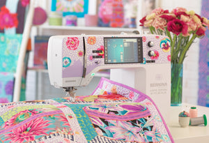

We Love Our Quilting Community
At High Country Quilts we care deeply about community. With our experiences in retail, we know that a store is not only a place to shop but also a place for the community to gather and share. During this busy...


You've got two bolts pulled out on the cutting table, one bright enough to catch the shop lights and one deep enough to settle the whole layout, and you're trying to decide whether they belong in the same quilt. That's the exact moment where turquoise and teal stop being “close enough” and start becoming two different tools in your fabric box. If you can tell them apart by value and saturation, you can choose blocks, borders, and precuts with a lot more confidence.
Turquoise and teal also come with very different histories, which helps explain why they feel different in hand. Turquoise is tied to a real mineral, a long trade history, and an English color name recorded much earlier than teal, while teal is a newer color term that entered English in 1917 and comes from the bird with the same name (GIA's turquoise history, shades of cyan reference). For quilters, though, the useful part isn't the etymology, it's what your eye sees under store lighting.
The easiest way to think about these two colors is this. Turquoise usually reads as the brighter, lighter blue-green, while teal settles deeper and more muted. In technical color language, that means turquoise carries more lightness, and teal carries more depth, so they don't behave the same way once they're cut into small pieces and stitched into a top (color comparison reference, palette reference).
Stand close first, then step back. Under shop lights, turquoise tends to announce itself faster because it sits higher in brightness, while teal often looks more grounded and receding. That difference matters when you're deciding whether a print should lead a block or disappear into the background.
A simple shop-floor test helps. Hold the bolt under the overhead lights, then step back about six feet. If the color still feels lively and forward, you're looking at a turquoise role. If it calms down and supports the other fabrics instead of jumping ahead, it's acting like teal.
Practical rule: don't trust the name on the selvage alone. Trust the bolt's behavior beside cream, navy, and gray.
The historical side even fits the visual side. Turquoise is the more concrete, material name, because it started as the name of a specific mineral, a hydrous phosphate of copper and aluminum (University Art). Teal is just a color term, so it has less of that gemstone baggage and more of a design-system feel.
If you want a quick non-quilting reference point, take a look at find turquoise farmhouse accents. Seeing the hue in another setting can help your eye separate “bright blue-green” from “deep blue-green” before you shop for yardage.

Turquoise and teal make sense together because they solve different jobs in the same top. Turquoise advances visually, so it gives you a place to land the eye. Teal recedes a bit, so it gives you depth and lets the brighter fabric stay readable instead of getting swallowed up by a busy print.
That's the same reason painters use a lighter foreground against a darker background. In quilting, the lighter swatch doesn't have to be the biggest piece, but it should be the one you want noticed first. The darker swatch can frame it, support it, or hold the outside edge of a block.
The common mistake is stacking two fabrics that sit too close in value. Two turquoise prints at nearly the same brightness can blur together, especially once they're cut into smaller pieces. The quilt starts to look washed out, not because the colors are wrong, but because the eye can't find a resting point.
A more useful bundle has four jobs, not just four fabrics. One bright turquoise focal, one deep teal anchor, one neutral blender, and one small-scale print gives the layout structure. That mix lets you build movement without making the quilt visually noisy.
Decision check: if both fabrics look equally loud from across the room, they're competing. If one steps forward and the other steps back, they're working together.
For room-style inspiration, drapery advice for blue rooms can help you see how lighter and darker blue-green tones behave against neutrals and deeper blues. The same contrast logic applies when you're laying out a quilt on a design wall.
Video can also help you see the balance in motion.
The practical payoff is simple. Use turquoise where you want energy, use teal where you want structure, and keep one neutral nearby so the palette has room to breathe. That's how you get a quilt top that feels intentional instead of crowded.

A good stash starts with roles, not just pretty bolts. If you know which fabric is supposed to lead, which one is supposed to settle in, and which one is only there to bridge gaps, shopping gets much easier. Turquoise and teal both work in modern blender lines, tonal prints, geometric fabrics, and batiks, but each type performs a different job at the cutting table.
Use turquoise for the pieces you want to notice first. A bold focal print, a lively small repeat, or a brighter batik can all fill that job well. Use teal for the anchoring job, especially in borders, sashing, or any block that needs to hold the composition together.
Low-volume background fabrics matter too. Cream, soft gray, and pale neutrals help turquoise stay crisp without turning the quilt into a block of color. Teal needs that breathing room even more, because its darker value can swallow detail if every surrounding fabric is equally strong.
For a beginner, precuts make the stash easier to manage. Fat-quarter bundles give you enough variety to test value contrast. Layer cakes and mini charms help you sample more prints without committing to full yardage. If you're building your cart in one visit, start with one focal turquoise, one deep teal, one neutral blender, and one print with movement.
| Stash Role | Suggested Color | Best Format | Why It Works |
|---|---|---|---|
| Focal print | Turquoise | Fat quarter or layer cake | Gives the quilt a bright first read |
| Anchor fabric | Teal | Yardage or fat quarter | Adds depth at borders and sashing |
| Blender | Soft gray or cream with blue-green tone | Yardage | Separates busy prints cleanly |
| Accent print | Small-scale turquoise and teal mix | Mini charms or fat quarter | Bridges both colors without flattening the layout |
You don't need a giant setup to start cutting. A quality rotary cutter, a 6" x 24" ruler, a fresh blade, a neutral thread, and a pressing mat cover most beginner turquoise-and-teal projects. If the blade drags, the value contrast gets muddy because the edges aren't clean enough to show the color change.
High Country Quilts carries fabric, precuts, patterns, and sewing notions that fit this kind of build, so you can choose yardage and tools in one stop. That matters when you're trying to compare teal against turquoise under the same shop lighting instead of guessing at home.
Some patterns make turquoise and teal work harder than they should. Others let the colors do the talking while the construction stays simple. The best beginner choices are the ones that show value contrast clearly, because that's where this palette looks sharpest.
A straightforward patchwork quilt using 5" charm squares or fat quarters is the easiest place to start. The block structure stays simple, so the color difference carries the design. A low-volume cream sashing makes turquoise pop without making teal look dull.
A half-square-triangle layout gives you more motion. Alternate turquoise and teal triangles and you get a soft directional shift that feels almost ombré without requiring complicated piecing. The diagonals help the brighter color move forward while the deeper shade holds the shape together.
A strip-pieced quilt or jelly roll race layout is ideal if you want long runs of color to do the work. Turquoise strips show movement quickly, and teal strips frame the brighter areas so the quilt doesn't lose structure. If you want a more traditional look, a simple log cabin can also work, because the center square and surrounding rounds let one color anchor the other.

Use patchwork if you want to practice accurate 1/4" seams without fighting the fabric. Use half-square triangles if you want the palette to feel more active. Use strip piecing if you'd rather sew long seams and let the color placement do most of the design work.
A dark teal outer border can frame a bright turquoise center without stealing the show.
That framing trick is useful in classes too. If you're taking a pattern to a local workshop, bring one turquoise focal and one teal anchor so your instructor can help you sort the value before you cut anything.
Good cutting keeps turquoise crisp. Good pressing keeps teal from muddying the seams. If the edges aren't clean, the color story gets lost before the quilt even reaches the batting.

Press seams toward the darker side, which is usually teal. That keeps the lighter turquoise from showing a shadow line through the top. Chain-piecing also helps, because it keeps your fabric order consistent and reduces the chance that a dark piece gets flipped into the wrong place.
Squaring up blocks on a rotating mat helps points stay sharp, especially in triangle-heavy layouts. If your corners wander, the eye notices the mistake before it notices the color. A clean block edge makes the turquoise read brighter and the teal read more intentional.
Thread choice matters at quilting time. A soft sky-blue thread can disappear in turquoise sections, while a deep navy or graphite thread blends better into teal. If you don't want to switch threads, a warm gray all-purpose option is usually the safer middle ground.
A cream or natural backing keeps a dark teal quilt from feeling heavy on the back side. Batting also changes how the surface reads, because loft can soften contrast a little and make the quilt feel less stark. That works in your favor if the front already has strong turquoise highlights.
The goal is simple. Let the colors stay readable after stitching, not just when they're stacked on the cutting table. When the seam lines, thread, and backing all support the same value plan, the quilt looks cleaner from across the room and up close.
A good shop visit starts with a quick value check, not with a cart full of guesses. Pull the turquoise and teal bolts at the cutting table, lay them beside cream or gray on a side table, and ask for a second opinion if the colors look close. That simple habit saves you from buying two fabrics that read the same once they're cut into smaller pieces.
Look for coordinating precut bundles, blenders that bridge the two hues, and notions that help you cut and mark accurately. If you're piecing on a BERNINA machine, the right accessories can make seams and feeds more consistent, especially on small blocks. Marking tools also matter on dark teal fabric, where a pale line is easier to see than a pencil that disappears into the cloth.
A beginner class can help here too, especially if you want hands-on guidance with color placement or machine setup. Sit-down machine training is useful when you're still learning how your machine handles quarter-inch seams, chain-piecing, and pressing workflow. That kind of support makes the palette easier to use because you're not fighting the machine while you're trying to judge the colors.
Before you leave, do one last test. Hold the fabrics together under the shop lights, then imagine them in a finished block with a neutral blender beside them. If the brighter fabric still leads and the darker one still grounds the layout, you've got a workable pair.
High Country Quilts can help you compare turquoise and teal in person, choose precuts or yardage, and pair them with the notions that make beginner piecing cleaner. Visit High Country Quilts to browse fabric, patterns, and machine support, then bring your top color choices back to the cutting table and test them under real shop light.
At High Country Quilts we care deeply about community. With our experiences in retail, we know that a store is not only a place to shop but also a place for the community to gather and share. During this busy...

Hi! We’re Adam and Renee Wheaton, the new owners of High Country Quilts! For more than 40 years, we’ve owned and operated vacuum and sewing businesses. Following in Renee’s father’s footsteps after he retired from All Discount Vacuum and Sewing in Colorado...


Leave a comment