
We Love Our Quilting Community
At High Country Quilts we care deeply about community. With our experiences in retail, we know that a store is not only a place to shop but also a place for the community to gather and share. During this busy...


You're probably in one of two places right now. You're standing in front of a wall of fabric, pulling bolts in and out, loving each one by itself and doubting all of them together. Or you're at home with a stash you've built over time, trying to make one new purchase play nicely with fabrics you already own.
That stuck feeling is normal. Fabric color matching can look like a magical talent some quilters were born with, but it isn't. It's a skill, and like cutting accurately or pressing well, it gets easier when you know what to look for.
The biggest shift is this. Stop asking, “Do these fabrics match perfectly?” Start asking, “Do these fabrics work together for this project?” Those are not the same question. A strong quilt often depends less on exact matching and more on value, contrast, scale, and context.
Many guides stop too early. They tell you to use a color wheel, pick complementary colors, and trust your instincts. Helpful, yes. Complete, no. Real quilt success also depends on how a fabric looks next to your existing stash, how thread and binding behave, and what happens when the whole thing moves from shop lighting to your sewing room.
A quilter came into the shop with three fabrics she loved. One was a soft floral, one a neat geometric, and one a background she was sure should work. On the table, the first two sang. Add the third, and the whole pull went dull.
Nothing was “wrong” with that background fabric. It was the wrong partner for those specific prints. Its value sat too close to the floral, and its undertone leaned cooler than the rest of the stack. Once we swapped it for a warmer cream with a clearer light-dark separation, the palette clicked.
That's usually how fabric color matching works in real life. It rarely falls apart because a quilter has terrible taste. It falls apart because one important detail got missed. Most often, that detail is value. Sometimes it's undertone. Sometimes it's scale. Quite often, it's that a fabric looked good alone but not in the company it had to keep.
There's also the stash problem. Buying a coordinated bundle is one thing. Matching a new print to twelve fabrics you bought across different seasons, different brands, and different lighting conditions is much harder. That challenge gets even messier online, where your screen may show a color differently than mine.
A practical system helps. Instead of relying on a hunch, train your eye to check a few specific things in the same order every time. When you do that, color choices stop feeling mysterious and start feeling manageable.
That's where confidence comes from. Not from always getting it perfect on the first try, but from knowing how to diagnose why something works, why something fails, and how to fix it before you cut.
Color theory sounds lofty until you reduce it to the three parts quilters utilize. For fabric color matching, the most useful pillar is this: hue, value, and saturation.

Hue is the basic color family. Red. Blue. Green. Gold. Plum. It's the word you'd use first when describing a fabric to a friend.
Hue matters, but quilters often give it too much power. Two blues can still fight. One may have a green cast and feel coastal. Another may lean violet and feel wintry. That difference is undertone, and undertone is why fabrics in the “same color” family don't always belong together.
If you've ever struggled with decorating a room full of white walls, you've seen the same issue. Creamy white, blue-white, and gray-white can clash even when they all read as “white.” The same kind of undertone awareness shows up in decorating tips for white interiors, and it applies beautifully to fabric pulls too.
Value is how light or dark a fabric is. In quilting, value usually matters more than hue. It creates shape, movement, and contrast. When a quilt looks flat, muddy, or hard to read, value is often the culprit.
The easiest test is the black and white photo test. Take a picture of your fabric pull and turn it grayscale on your phone. If the fabrics separate clearly, your design will usually read better. If everything melts into one middle gray, the quilt may lose definition no matter how pretty the colors are.
Practical rule: If you can't tell your fabrics apart in black and white, your patchwork may not stand apart in the finished quilt.
Here's a quick way to understand:
| Element | What it means | What happens if it's off |
|---|---|---|
| Hue | The color family | Fabrics may feel unrelated |
| Value | Lightness or darkness | Quilts look flat or confusing |
| Saturation | Intensity or softness | The palette feels too loud or too dull |
Saturation is the intensity of a color. A clear cherry red is more saturated than a dusty brick red. A jewel-tone teal feels very different from a faded sea-glass teal, even if they share a similar hue.
Many stash combinations start to wobble. A highly saturated print beside a bundle of softened, vintage-feeling fabrics can dominate the group. That may be exactly what you want, or it may look accidental. Decide on purpose.
A useful reality check comes from textile science. A total color difference (∆E) value of 1.0 or less is considered imperceptible to the human eye in the 1976 CIE Lab* color space, which helps explain why some almost-matches feel fine while others still look slightly off when you study them closely in a project setting (IntechOpen on textile color difference).
For shopping, planning, or refining a pull, it helps to keep your choices visible. If you want to compare solids, prints, and blenders more easily, browse a dedicated quilting fabric collection and sort by the colors you're trying to support in your stash.
Perfect matching is overrated. Clear value contrast and compatible undertones usually matter more.
You pull a print from your stash that would be perfect if the blue were a hair grayer, then spend twenty minutes digging through bins looking for the fabric you know you bought three years ago. That is the moment a simple matching system earns its keep.

A useful toolkit helps answer practical questions fast. Does this new blender belong with that older floral. Is this binding reading dark enough. Will the thread disappear, or will it draw a line through every seam. You do not need a studio full of gadgets. You need a few tools you will reach for while standing over your stash.
I keep coming back to the same basics because they solve real problems:
Swatches matter even more if your stash spans different fabric lines, years, and manufacturers. Older background prints can drift creamier than current whites. A navy from one collection can lean purple next to another that reads inky or slate. A labeled scrap ring lets you compare before you cut into yardage or place another order.
Pretty is optional. Useful is the goal.
Keep a small sample of fabrics you buy repeatedly, fabrics you have enough of to use again, and fabrics with hard-to-match colors. Label what you know: manufacturer, collection, base color, and any notes that save future guesswork. I also like noting likely jobs such as "binding option," "good with shirtings," or "reads green next to blue."
Sort by color family first, then split into lights, mids, and darks. After that, make a small section for the problem solvers in your stash. Backgrounds, low-volume prints, stripe bindings, and the near-solids that bridge two louder fabrics. Those are the pieces that rescue a pull.
If you use custom prints, panels, or digitally printed focal fabrics, production choices can affect how color lands on cloth. A practical guide to the essentials of custom fabric printing helps explain why a design on screen and a printed fabric in hand do not always read the same way.
Do not stop at fabric, either. Keep thread cards, trim snippets, and binding leftovers with your swatches if you use them often. A thread that "matches everything" in the drawer can turn too cool on a warm taupe top. Rickrack, piping, and flange fabrics shift the whole palette once they sit at an edge.
Online shopping works well if you treat the first order like a test, not a commitment. Screen color varies, product photos vary, and your stash at home is the thing that has to agree with the new arrival.
A safer process looks like this:
One more shop habit helps. If a fabric is meant to support a favorite print from your stash, bring the swatch card with you or keep clear phone photos of the swatch ring sorted by color. Matching to what you own is a different job from choosing a pretty fabric in isolation.
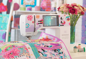
A short visual walk-through can help if you want to see fabric auditioning in action.
You pull a few fabrics from your stash, add one new print from the shop, and everything looks right on the cutting table. Then the blocks go up on the wall and one “quiet” fabric turns loud, the background goes pink instead of cream, and the binding you planned suddenly feels unrelated. That shift is normal. Fabric is judged in company, under real light, and at the size you cut it.

Light can rescue a palette or ruin it.
A blue that reads soft under shop fluorescents may look sharp by a window. A warm gray from your stash can turn mauve under a yellow lamp. One common culprit is metamerism, which means two colors appear to match in one light source and separate in another. Textile color work accounts for that by checking samples under multiple light conditions (Academia.edu on textile colour matching and metamerism).
The practical version is simple. Check fabric in daylight, under your sewing-room light, and under the lamp you use at night. If you are matching to older stash fabrics, do that comparison in the same room where those fabrics usually live. I have seen plenty of “good matches” fall apart when one fabric was judged in the shop and the other had only been seen at home under a warm bulb.
If your sewing space always makes colors feel muddy or slightly off, read up on choosing lighting based on CRI scores. Better color rendering will not make decisions for you, but it makes the differences easier to see before you cut.
Color is only part of the story. Value and print scale decide whether the quilt reads clearly or turns busy.
The squint test helps fast. Spread the fabrics out, then squint until the print details blur. What stays visible is the value pattern. If two fabrics are supposed to contrast but melt together, the block may lose definition. If one fabric pops far harder than the rest, it may need a smaller role.
Then check scale. A print that behaves nicely as a fat quarter can take over once it is cut into borders or repeated across many blocks. Small prints can do the opposite. They often blend into a texture, which is useful if that is the job, but disappointing if you expected a clear secondary color.
Here is the sort of problem I watch for at the table:
| What you're seeing | Likely issue | Usual fix |
|---|---|---|
| Large prints overpowering blocks | Scale too dominant | Add smaller prints or solids |
| Everything feels speckled | Too many similar small prints | Introduce one resting fabric |
| Colors seem to shift at a distance | Print scale is blending values | Step back and rebalance lights and darks |
A floral with cream, rust, and olive may look evenly balanced in your hand. Cut into a two-inch unit, it can read mostly cream. Across the room, a tiny navy print may act almost like a solid dark. Check fabrics up close, then pin a few pieces vertically and stand back. Quilts are usually viewed from across a bed or room, not from twelve inches away on a cutting mat.
Often, stash matching goes wrong. Quilters spend time getting the fabric pull right, then choose thread, binding, labels, zipper tape, or trim later from memory. Those smaller pieces can push the whole project warmer, cooler, cleaner, or duller.
Thread is the sneakiest one. A spool can look close enough, but stitched into a seam or used for quilting, it may read greener, grayer, or brighter than the fabric around it. Binding matters just as much because it frames the entire quilt. If the top is soft and slightly muted, a crisp high-contrast binding can feel pasted on, even when the color is technically related.
Set the finishing pieces out with the fabrics before you call the palette done:
The goal is not perfect theory. The goal is a quilt that still feels coherent after piecing, quilting, and finishing. Trust your eye, but give it the right conditions to judge what is really there.
A quilt style gives color a job. Modern quilts need clarity. Traditional quilts need structure inside the block. Art quilts often depend on subtle shifts. Scrappy quilts need enough consistency to keep the whole top from drifting apart.

Modern palettes usually work best with fewer voices. Pull one main color family, add one accent that has a clear reason to be there, and choose a background that separates cleanly from both. If everything is medium value, the piecing loses its edge fast.
Stash matching can be tricky here because modern quilts expose every near miss. A cream from one line and a bright white from another may both read as "light" in the bin, but together they can look accidental. I usually start with the background fabric first, then test accents against it. That saves a lot of second-guessing.
Traditional quilts can carry more print because the block does part of the organizing for you. The key is keeping the light, medium, and dark roles clear enough that the pattern still reads.
For stash sewing, sort by value before you sort by color. That one habit makes substitutions easier, especially if you're working from inherited prints, leftovers, or fabrics collected over years. A red floral and a tan shirting may belong in the same quilt if one reads light and one reads dark.
In many traditional quilts, value placement creates the pattern your eye sees first.
Art quilts give you more room to work with mood. Close colors can be more interesting than obvious contrast, especially if the fabric surface changes from matte to shiny, smooth to nubby, or quiet to textured.
That freedom has a trade-off. One extra fabric with the wrong intensity can break the spell. If your pull is built around smoky blue-greens and weathered neutrals, a single candy-bright print often feels pasted on. Keep editing until every piece belongs to the same conversation.
Scrappy quilts look easy because they welcome variety. Good scrappy quilts are edited just as much as modern ones. The editing rule is distinct.
Pick one thing to stay steady. A repeated background, one color that appears in every block, a narrow value range, or a consistent print style all work. That rule helps you use older stash fabrics, odd half-yards, and favorite leftovers without making the quilt feel random.
Scrappy projects also expose the parts quilters leave for later. Binding, thread, labels, zipper tape for coordinating accessories, and trims all need to belong to the same color story. As noted earlier, those finishing choices often create the mismatch, not the patchwork itself. In a busy quilt, a too-clean white label or a thread that turns noticeably cool can read louder than expected.
If you want a head start, curated precuts can help because some of the editing is already done for you. A practical option is exploring precut fabric bundles for quilt palettes when you want coordination but still plan to mix in fabrics from your own stash.
Before the first serious cut, make one test block. Not a whole row. Not optimistic chain piecing. One block. A block tells the truth faster than a stack of folded fabrics ever will.
Then put your cut pieces or your test block on a design wall and walk away from it. Come back later. If something nags at you from across the room, listen. Small unease early is easier to fix than full regret after assembly.
Flat usually means the values are too similar. The colors may be lovely, but if most of them sit in the same light-dark range, the quilt won't have enough structure.
Try adding one distinctly darker fabric, one distinctly lighter fabric, or both. If you're using mostly prints, a solid or low-volume fabric often creates the separation your eye needs.
Fighting colors often have mismatched undertones or one fabric that's much cleaner and brighter than the rest. Put the fabrics side by side and ask whether they share the same temperature. If not, either replace the outlier or add a bridge fabric that contains both tendencies.
Thread can also stir up trouble here. A top that's almost right can become obviously wrong once a cooler thread line runs through every seam.
Busy is usually a scale problem, not a color problem. Too many high-activity prints, too many similar mediums, or no place for the eye to rest can all create visual chatter.
Add a solid. Add a quieter blender. Reduce the number of prints with strong contrast inside the print itself. The palette doesn't need to become boring. It just needs a little breathing room.
One more thing matters. Fabric consistency helps matching feel less random. In professional textile dyeing, color across a sample should be uniform within a coefficient of variation of less than 5%, a standard tied to reliable color matching workflows (IntechOpen on precision dye uniformity). Quilters feel the practical version of that when quality fabric behaves predictably from cut to cut and from one supporting print to another.
Bring your swatches, your almost-right fabrics, and your questions into the decision. A second set of trained eyes can spot value gaps, undertone issues, or finishing details you've stared past.
Bring your fabric swatches to High Country Quilts and compare them in person with quilting cottons, precuts, notions, and finishing options before you commit. If you're matching to an existing stash, that side-by-side check is often the fastest way to turn a maybe into a confident yes.
At High Country Quilts we care deeply about community. With our experiences in retail, we know that a store is not only a place to shop but also a place for the community to gather and share. During this busy...

Hi! We’re Adam and Renee Wheaton, the new owners of High Country Quilts! For more than 40 years, we’ve owned and operated vacuum and sewing businesses. Following in Renee’s father’s footsteps after he retired from All Discount Vacuum and Sewing in Colorado...


Leave a comment